
You are using an out of date browser. It may not display this or other websites correctly.
You should upgrade or use an alternative browser.
You should upgrade or use an alternative browser.
Why Your Title Screen Is Ugly and How to Fix It
- Thread starter Perihelion
- Start date
Perihelion
Sponsor
White title screen looks best, Petros. Dump the Japanese text.
That said...
I actually think Japanese is worse than other languages just because it's so overplayed by kids trying to look cool. But, yeah.Commodore Whynot":hf3seq6d said:About the folks saying "german is just as bad as Japanese", I don't think anyone is honestly suggesting otherwise. The point is not that it's Japanese. The point is that it is not English (or, more specifically, it is not the language of release).
That said...
Holy shit, that game sounds amazing. I'm now imagining some kind of dating game where you're young Hitler trying to pick up Jewish girls, failing horribly, and going on to murder them all!!!Calling your game Last Legend: Das Fuhrer Ist Int Mein Undervarren is completely stupid unless it is either a german game, or has been translated into german.
Lune de la Cruor
Member
It's also stupid for a german game, because the title doesn't make any sense :OCommodore Whynot":tv52wo9p said:Calling your game Last Legend: Das Fuhrer Ist Int Mein Undervarren is completely stupid unless it is either a german game, or has been translated into german.
Anyway, I think these guidelines are quite nice and all.
However, I think we shouldn't close our minds to something that is different and does not follow this formula or the points given here.
I think with the right interpretation, almost any kind of text, sign, whatsoever can be used.
Perihelion
Sponsor
These are definitely open to interpretation, and I did preface the thread with a statement that this is my opinion and that rules can be broken. :p This isn't the Gospel, only the Gospel according to Peri.
Yes, it's true that pretty much anything can be used well. That said, it's really, really, really hard with some things, and if you think you're the exception to the rule...you're probably wrong. Unless you're a professional or something, and even then you'd better be careful. Sorry, but that's how it goes!
Yes, it's true that pretty much anything can be used well. That said, it's really, really, really hard with some things, and if you think you're the exception to the rule...you're probably wrong. Unless you're a professional or something, and even then you'd better be careful. Sorry, but that's how it goes!


")
Perihelion
Sponsor
That is much better, but your text is really boring. I mean, absolutely don't junk it up with Photoshop crap, but you can do something more interesting with it, I think.
Glitchfinder
Staff
Eriol Clowphengire":1uhmz3xa said:The game itself takes place in two worlds, the in-game MMO entitled Seeds of Orion and the alternate Earth. However, it seems the background is busier than the title...
The story is basically gamers playing the said fictional MMO, and the AI moderating the game gained sentience.
This title and description makes me think of the .hack series. I mean, the entire point of that group of various anime, games, and other media is that it's about a game with a true AI governing it. Add the fact that the majority of the series feature stacked hexagons in titles, packaging, and various other locations, and you'll see where I'm going. As for the title, I'd recommend darkening the hexagons, and then breaking the stack, if you're going for a .hack theme. (So, instead of a honeycomb, you have part of the screen with no hexagon) That being said, I would also recommend that, if possible, you should get rid of the hexagons. They weren't usually featured in the game titles, and were much more likely to appear in the packaging and cut-scenes.
Eriol Clowphengire
Member
Glitchfinder":1uimkim0 said:Eriol Clowphengire":1uimkim0 said:The game itself takes place in two worlds, the in-game MMO entitled Seeds of Orion and the alternate Earth. However, it seems the background is busier than the title...
The story is basically gamers playing the said fictional MMO, and the AI moderating the game gained sentience.
This title and description makes me think of the .hack series. I mean, the entire point of that group of various anime, games, and other media is that it's about a game with a true AI governing it. Add the fact that the majority of the series feature stacked hexagons in titles, packaging, and various other locations, and you'll see where I'm going. As for the title, I'd recommend darkening the hexagons, and then breaking the stack, if you're going for a .hack theme. (So, instead of a honeycomb, you have part of the screen with no hexagon) That being said, I would also recommend that, if possible, you should get rid of the hexagons. They weren't usually featured in the game titles, and were much more likely to appear in the packaging and cut-scenes.
Yup, NetGame Crisis Saga's inspired by the .hack// franchise. Might as well use tech circles and some nitty-gritty techno-thingamajig.
I'll still use foreign language due to the fact the game will move from country to country. It may seem violating, but I'm giving out ideas to the players where will the Crisis go next.
My first game actually takes place first in a fictional Australian state called Emerald Maple (though it's more of fictional Canada), so it's mostly English.
And it's planned that the next game after this will take place in fictional part of South Korea, that's why I'll still use Korean text (might as well Babelfish the English version of the next game before I do that)
Okay I dug this one out of the old digital attic, you'll laugh your asses of with just how bad it is. Let me set the scene, the year was 2005, I had gotten my first copy of RPG Maker XP and had begun designing the titlescreen to my first XP RPG ever, Final Fantasy Z, that's right Z not Zero.
How did it turn out...
Open the spoiler and begin to laugh your asses off. This is the PERFECT example of how NOT to do a titlescreen:
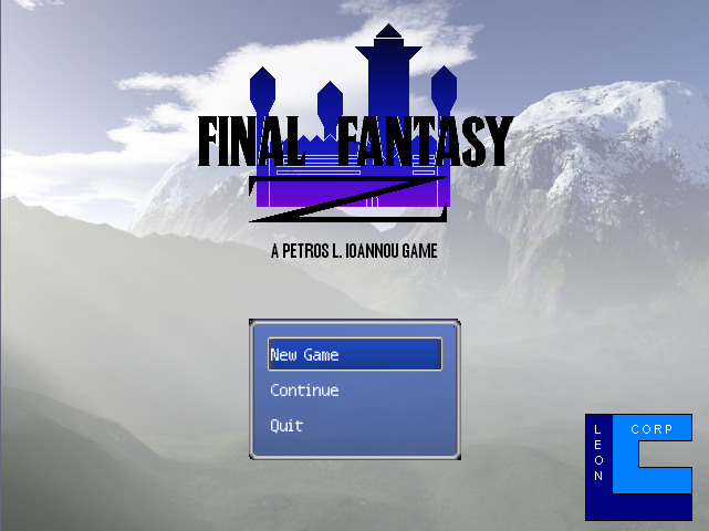
I had to show this somewhere and I thought anyone reading this topic would get a kick out of it. So, enjoy!
How did it turn out...
Open the spoiler and begin to laugh your asses off. This is the PERFECT example of how NOT to do a titlescreen:
I had to show this somewhere and I thought anyone reading this topic would get a kick out of it. So, enjoy!
ShinyToyGuns
Member
Is my title screen ugly too? =(

Please be gentle =P
Please be gentle =P
Perihelion
Sponsor
@Petros: The first title screen I ever made was worse. Oh, so much worse. I wish I still had it; you guys would love it. ;[
@ShinyToyGuns: Not a bad concept, but I recommend simplifying it. Dump the background and focus your attention on the title itself instead. The font's a bit ornate but not terrible. What I'd recommend is taking the idea of the storm motif and turning it into a logo of some sort--some kind of stylized vectored lightning bolt integrated with the text, perhaps. I dunno, play around with it and see what you get.
@ShinyToyGuns: Not a bad concept, but I recommend simplifying it. Dump the background and focus your attention on the title itself instead. The font's a bit ornate but not terrible. What I'd recommend is taking the idea of the storm motif and turning it into a logo of some sort--some kind of stylized vectored lightning bolt integrated with the text, perhaps. I dunno, play around with it and see what you get.
Diaforetikos
Member
I agree completely with Peri, and I would also like to add a few words of advice. Now I don't have title screen examples, but I do have some basic art theory ideas that would help a lot. Here are a few.
-Complementary colors are very simple, but very powerful. Here is a picture on how it works.
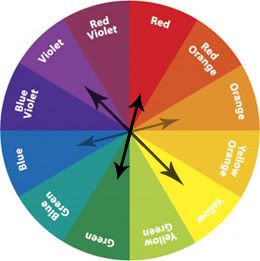
The colors on the opposite side of the wheel are complementary colors. Team jerseys usually utilize this rule a lot.
-I can't reiterate Peri's advice enough on fonts. Fonts have a major effect on moods or themes. I don't know typography and I wont act like I do, but I do know what fonts work with themes and which ones don't. Don't use bland, boring fonts. Don't use over worked or exaggerated fonts with unnecessary amounts of curls and dots. Just because your theme has a medieval theme does not mean you should use or have to use a gothic old english font. Stay away from medieval fonts! Look at the examples in the first post and ask yourself what attracted you to those fonts. Ask what you didn't like about them. Use your answers as guidelines for your fonts. I advise looking up general rules on typography to get a feel on what you should be looking for when you choose your fonts.
-Your experience with Photoshop does not excuse from hideousness. Generally everyone knows how to lay down fonts or a photo, how to lay down a gradient, and how to use the lasso tool. With these simple tools, you can create something very decent. You shouldn't force effects and filters while working with Photoshop. Use those last and limit their use. Here is an example of a basic title screen. Ignore the background please. Just focus on the fonts, the font placement and color choice.
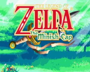
Ignore the shapes inside the 'z'. Notice there is only 2 strokes around it, and that is all. No gradients, no glow. Simple color choice. The red attracts the eye along with the words of most importance being bigger. The green hints at the theme of the game. The fonts lead you through the words without distraction. The background should also hint at the game, but don't be ambitious. Simple goes a long way. When you feel comfortable with your simple background, slowly add more to it. See what works and what doesn't, then ask for crits.
-Another major turn off is word choice. It may not seem like a big deal, but your words tell gamers what the game is about. If your phrasing is off, it may not even get played. I understand how hard it is to come up with a name for your game, especially with all the games that get pumped out, its hard to make your game name stand out, but that doesn't mean to try so hard, it sounds like another game. Fates of Day, just made that up to sound cool (obviously). No thought went into it, but its my title. That is a big no-no. Your focus should not be to stand out, or sound 'cool'. Your focus should be your game and nothing else.
-------------------------------------
These topics are small but make a big difference. If you dont agree, please state why. I am also very bad with trying to get across what I mean, so my phrasing may be off. But I reread it and it seemed to be what I wanted. Don't underestimate yourself. You know what looks good to you. You know what attracts you to good design. Take those elements and use them in your title screen. Just don't half do it because of laziness or because you think its not good. If you do that, you might as well scrap the game. Doing that shows how much dedication you have.
I should post a random title screen...
-Complementary colors are very simple, but very powerful. Here is a picture on how it works.
The colors on the opposite side of the wheel are complementary colors. Team jerseys usually utilize this rule a lot.
-Your experience with Photoshop does not excuse from hideousness. Generally everyone knows how to lay down fonts or a photo, how to lay down a gradient, and how to use the lasso tool. With these simple tools, you can create something very decent. You shouldn't force effects and filters while working with Photoshop. Use those last and limit their use. Here is an example of a basic title screen. Ignore the background please. Just focus on the fonts, the font placement and color choice.
Ignore the shapes inside the 'z'. Notice there is only 2 strokes around it, and that is all. No gradients, no glow. Simple color choice. The red attracts the eye along with the words of most importance being bigger. The green hints at the theme of the game. The fonts lead you through the words without distraction. The background should also hint at the game, but don't be ambitious. Simple goes a long way. When you feel comfortable with your simple background, slowly add more to it. See what works and what doesn't, then ask for crits.
-------------------------------------
These topics are small but make a big difference. If you dont agree, please state why. I am also very bad with trying to get across what I mean, so my phrasing may be off. But I reread it and it seemed to be what I wanted. Don't underestimate yourself. You know what looks good to you. You know what attracts you to good design. Take those elements and use them in your title screen. Just don't half do it because of laziness or because you think its not good. If you do that, you might as well scrap the game. Doing that shows how much dedication you have.
I should post a random title screen...

Zekallinos
Sponsor
There's a cool software I found that helps choose colors when there are 3 or more. I don't know how it actually fits into color theory but the results it gives me always seem eye-pleasing. What do you think?

Since i obviously have no clue what i am doing with my title, because everything i think looks good actually looks bad, and people want things to look professional... can someone suggest a good font that shows that my game is fantasy yet kinda medieval yet it has humor?
Considering how everything i used to think looked awesome, actually looks bad, should i just do a simple title with a plain black text and and no real graphics?
I'm at a total loss honestly....
Considering how everything i used to think looked awesome, actually looks bad, should i just do a simple title with a plain black text and and no real graphics?
I'm at a total loss honestly....
Perihelion
Sponsor
Can you repost it here? It doesn't need to be plain, but if you're going to have a graphical background, you need to do appropriate font and etc. Lots of good title screens, especially modern ones, have elaborate graphics, but it's tougher to pull off, which is why I didn't focus on them in this article.
Thank you for viewing
HBGames is a leading amateur video game development forum and Discord server open to all ability levels. Feel free to have a nosey around!
Discord
Join our growing and active Discord server to discuss all aspects of game making in a relaxed environment.
Join Us