Envision, Create, Share

Welcome to HBGames, a leading amateur game development forum and Discord server. All are welcome, and amongst our ranks you will find experts in their field from all aspects of video game design and development.

Why Your Title Screen Is Ugly and How to Fix It

This is actually a really good topic Peri, I see this all the time where people use overly extravagant title screens, I fell victim to that once and I think I still do to be honest although I'm considering an overhaul of my title screen anyway. I have two questions, first, where did you get that pretty damn cool RTP tileset, I really like it, you rarely see good modern style RTP sets.

Anyway that was off-topic but here's my current title screen, on the opinions I've gotten from people, some love it, others are indifferent to it. Maybe it's just me looking at that screen for so long has made me grow to dislike it but here it is:

Title2.jpg


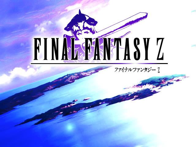
Opinions, Peri, Mawk?

PS: Selwyn, are you still making that game? I thought I was the only one stubborn enough to be sticking to a single project for this long lol!
 
Nice topic!

I disagree somewhat on one part, and that's the thing about making your title screen match the graphics of your game. I see nothing wrong with a neat looking title screen that uses vectors or painted semi-realism or whatever. The player would be foolish to make an assumption of the game's graphics based off it.

You used SNES examples, or games that try to fit a retro "vibe", and the problem there is that the SNES was only capable of 256 colors, and that's it. They HAD to stick to pixel art or their titles would look ridiculous. Makers nowadays offer 16.7million colors and there's no reason to religiously adhere to the accepted norms of 10-15 years ago.

I agree that if you're going for retro, go all out. But if not then it's not a big deal. The legibility of the text, paired with the use of negative and positive space (and/or spacing elements), with a minor focus on motion, flow, and color control---that's what's most important. Congruence with in-game graphics' style is, in my opinion, a kitschy afterthought, and not very weighty on the end product.

That said, I don't really ever like seeing painted character concepts in a title. A title should be an abstract of the overall point of your game, not an illustration of who you're gonna be running around as. Also, it draws away attention from the title text, which is the most important part!!! But that's more a point of concept than method.

But photos... Good god avoid photos at all costs always.
 
I'm not quite as good as Peri in design, but I can give people my input.

@Selwyn - I like the simplicity of it a lot, but it feels the title should stand out more. In my opinion, the design in the top bar and the fact that it's lighter than the lower section draws my attention to the "New Game", not the title. I think it would be better if you made the design in the top bar lighter to match the lighter background (which would cut down on the contrast that draws one's eyes to it) and also made the title a little bigger (which could also help cut down on some of the empty space).

@LegacyX - I think it looks pretty decent because the title is definitely the center of attention. The only critique I could give would be the relevance of the circles and symbols.

@Petros - It's nice, but I think the glow from the right is too strong. It keeps pulling my attention to the right side. In my opinion, it would look better if you cut down on the glow a little and centered it more so it highlights the title instead of that area to the right.
 
Oh, hey, I forgot about this thread! Sorry, guys. >_>

@Ven: You raise an excellent point, and now that you mention it, I can in fact think of a number of modern ports of old games that break that rule. I guess the big point I was trying to make was that retro-styled things should look retro, and otherwise you shouldn't have anything GLARINGLY out of place. So I think using 3D models in 2D game title screens is pretty weird unless you have 3D cutscenes or something, and photos are of course really ugly, but aside from that I've probably been belaboring the point overly much. It doesn't have to be a perfect match, just not...hugely out of place. I'll revisit that point! Thanks for the input, though. :3 I was hoping you'd give me your PROFESSIONAL OPINION on the subject...........

@LegacyX: The concept itself isn't bad, and I think it works. Logo's too elaborate and Photoshop-y for my tastes, and oh god Japanese text in American titles gives me aneurysms (seriously, why??????), but aside from that, it works.

@Selwyn: I like that, actually. Clean and functional. I'd add more contrast, though. The stuff behind the text is a little hard to see, and the background could stand to be darker.

@Petros: Background's a bit distracting, imo. Add more white around the logo so the top is mostly white and also put some blue in the logo itself. Aside from that, yeah, this is a lot better than I remember your old title screen being.
 
I updated the point about graphical consistency to make it less YOU MUST MAKE IT CONSISTENT OR YOU ARE A BAD PERSON. I also added a point about Japanese text. Oh god, how did I forget that in the first place?!
 

mawk

Sponsor

of course you need subtitles in a language unrelated to anything else in your game, especially if you're not developing the game in that language and don't even speak it to begin with.

incidentally, my game's title has been extended to Mountain: Shan Fei dà dei calci ad alcuni sciocchi con il suo compagno meccanico Robotman
 
NGCS_PV_TitleScreen.png

The game itself takes place in two worlds, the in-game MMO entitled Seeds of Orion and the alternate Earth. However, it seems the background is busier than the title...

The story is basically gamers playing the said fictional MMO, and the AI moderating the game gained sentience.
 
Yeah, the background is definitely a problem. You could try making the hexagons in the background darker. Because they're brighter than the title, they stand out more against the dark background.

Also, I have a title screen for a two-week project I'm working on.
Capture-1.png

I originally liked the yellow windowskin, but I'm starting to think I might go for a silver color instead. The background is the Parallax I'm using throughout most of the game and that shrine thing has importance later on in the story.
 
About the Japanese text Peri, do you think its okay in my one being that it is a fangame and that is how the logos are set up even across the seas? Out of curiosity that is.
 

mawk

Sponsor

the titles have Japanese text in their Japanese releases, but from what I've seen, not in their other localizations. since your fangame is English, it'd make more sense to treat it as an English localization.
 
Oh wait, speaking of putting up foreign characters in titles... apparently, one of my future games will take place in fictional Korea and Japan... so is it okay to add them, in respect to the setting of my game(s)?
 

mawk

Sponsor

as a general rule of thumb, unless you are developing the game in a foreign language, foreign languages should not feature prominently in the title.
 
Petros":2705g463 said:
About the Japanese text Peri, do you think its okay in my one being that it is a fangame and that is how the logos are set up even across the seas? Out of curiosity that is.
No.

Eriol Clowphengire":2705g463 said:
Oh wait, speaking of putting up foreign characters in titles... apparently, one of my future games will take place in fictional Korea and Japan... so is it okay to add them, in respect to the setting of my game(s)?
No.

mawk":2705g463 said:
as a general rule of thumb, unless you are developing the game in a foreign language, foreign languages should not feature prominently in the title.
Yes.
 
That said, it's okay to have a little text in foreign languages smattered about the game--for example, signs in your language of choice--but it shouldn't be in the logo, and it shouldn't be in any actual dialogue or anything. It just...doesn't belong there.

That said, there's definitely a double standard. Languages that aren't Asian are much more acceptable because they don't scream weeaboo. If you did, like, German or Arabic or something, it would be less bad, although still weird.
 

mawk

Sponsor

it's still advisable to have a specific reason for the languages to be there, and it had better be a good one; it's not enough to say "well it's set in an analogue of Japan or based on Japanese aesthetics." the Xenosaga games had German subtitles because the subtitles themselves were excerpts from Nietzsche's writings and the game in general had an incredible boner for the man's philosophies, albeit applied in literal physical form. anything less than that and you're just reaching for an excuse.

doi, I'm still talking about title screens. took me until now to notice Peri was addressing ingame stuff.
 

Rappu

Member

Perihelion":3em52y1e said:
That said, there's definitely a double standard. Languages that aren't Asian are much more acceptable because they don't scream weeaboo. If you did, like, German or Arabic or something, it would be less bad, although still weird.
So true and this is so annoying. Gratuituous German or heck, gratuituous English is just as annyoing as dialogue littered with baka and kawaii. :P Then again, using words from different languages as names and suchlike is imho a-okay regardless of the game's culture; there foreign words are basically shout-outs to people who understand the language. It also saves the time of having to think up good-looking and -sounding letter scrambles for names if you don't want to use boring stuff like Big Elven Forest. :P
 
Petros, It's better to me in just plain white, reminiscent of the front covers to FF games (EU covers at least anyway). Will look better with the classic pointing cursor etc. I did say this at the time :P

2jcdel2.png
 
Perhaps with little glowing orbs scrolling slowly upwards, recent FF games love little blue ethereal orbs. (or something of this nature).
 
You did say that at the time lol. I think I'm going to change my logo and title screen, but I'll need to re-install photoshop before I do that. Wanna lend a hand again by chance?
 
None of the Final Fantasy games I own has Japanese text anywhere near the case. (VII to XII)

I think it definately looks better just plain white. After all, what most Final Fantasy games do is have a plain titlescreen like above, and then fade it into a lengthy introduction FMV with snazzy effects. That could easily be the map in your original version, etc. I dunno.

About the folks saying "german is just as bad as Japanese", I don't think anyone is honestly suggesting otherwise. The point is not that it's Japanese. The point is that it is not English (or, more specifically, it is not the language of release).

Calling your game Last Legend: Das Fuhrer Ist Int Mein Undervarren is completely stupid unless it is either a german game, or has been translated into german.

Foreign languages are used on professional title screens not just for the sake of it but because it is needed for folks of another lanuage to be able to play it.

Now if you were releasing your game in Japan or in Japanese then go ahead, use Japanese text.
 

Thank you for viewing

HBGames is a leading amateur video game development forum and Discord server open to all ability levels. Feel free to have a nosey around!

Discord

Join our growing and active Discord server to discuss all aspects of game making in a relaxed environment. Join Us

Content

  • Our Games
  • Games in Development
  • Emoji by Twemoji.
    Top