
Perihelion
Sponsor
Disclaimer: I have some strong opinions about this subject, and I'm not pulling punches in the following post. That said, these are opinions, and if you disagree with any of my points, I absolutely encourage you to bring it up so we can get a balanced discussion of the subject. It should also be noted that there are exceptions to any rule, but at the same time, unless you're a really swanky professional graphic designer or something, you probably aren't the exception.
There are a few things you should keep in mind when making your title screen. It's the first thing someone sees about your game, so it's really important that you make a good first impression.
I can't stress this enough: "making a good first impression" does not involve busting out all of your fanciest Photoshop filters. You want it to look professional, and that involves adhering to some basic design principles. As long as it does that, it's totally fine if it's incredibly simple.
Okay, So Where Do I Start?
There's more than one way to skin a cat, but traditionally, most title screens more or less use the following format:
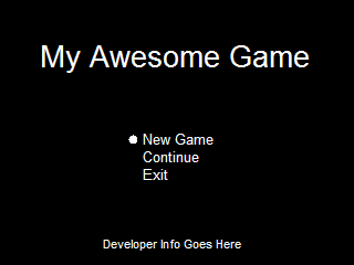
Now, this would obviously look better if I hadn't knocked it up in Paint in about 30 seconds, but you get the idea of the layout. Most SNES games follow this template, but more recent games sometimes vary a bit more. While you can do other things, sticking with this gives you the advantage of instant recognition that this is a video game title screen and not something else. In any case, there are three things a title screen should have: the title (duh), the new game/continue bit (unless you're handling that differently; for example, FF6 skips straight to the load screen with a new game option at the top), and you should probably include developer information as well.
Do's and Don't's
Some of these are open to interpretation, but I think this is a fair set of general guidelines.
Do not do the following:
Do do the following:
Professional Game Title Screens
These tend to be more elaborate than you're likely to be able to produce (or need, honestly), but you should be thinking along these lines. Before you fire up Photoshop and make your super original Final Fantasy ripoff logo, look at real title screens. I've provided a few for you. Note that I just googled whatever games came to mind, so they're not filtered for content or quality or style or anything. It should be a fairly random sampling of what you're up against.
For some reason most of the screenshots on Google don't have the new game/continue things visible, but whatever, you get the idea.

Dark background, game title, developer info. The title itself has enough visual interest that I guess they decided not to add more things, and it doesn't need them.

Again, except for a couple small details, it's basically just the title of the game and the developer info.

This has stuff going on in it, but the title is still the focal point. Note the color use. The title is orange and yellow--bright, vibrant colors--whereas the background consists of cool blues and teals, which recedes it from the foreground. It's also mostly pretty dark, so it doesn't distract from the title. The part with the metroid and the monitors, the focal point of the background, is not only in the center and brighter, but it's also got more yellow in it, bringing it forward.

This is sort of an extreme example of framing--it has the small band in the middle with the scene and then two large black bars blocking it off. It leaves enough visible to add some visual interest without totally dominating the screen. Again, note that the title is a warm color while the background is a cool color.
%20(Beta).png)
The background pattern is interesting but subtle enough that it's not distracting. The title is actually too hard to read, imo.

An exception to the "center everything" and "make the game title the most eye-catching thing" rules, but it works because it's so simple. The pendulum being off-center makes things more dynamic without making the entire thing look off-balance (the fancy C balances it).
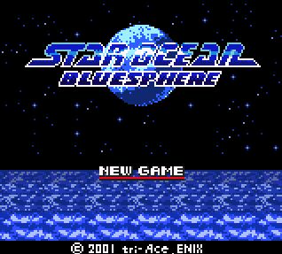
The star field is a nice subversion of the usual plain black background. Although the text is dark, the white stroke helps separate it from other similarly-colored elements.
Good Indie Game Title Screens
You're probably not going to be able to make something as fancy as the above ones, so take a look at what some of your fellow indie game makers are doing. I'd really like more variety here, so any suggestions for additions are welcome.
It should be noted that none of these are flashy. I call them good, but not because they're extraordinarily attractive--I call them good because they work. They get the job done while having good design and conveying a sense of what the game is like.

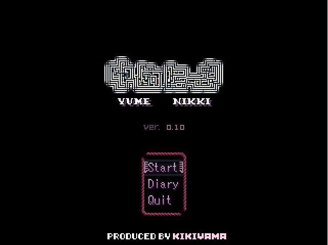
Cave Story has been a ridiculously successful indie game, and yet the title screen is that minimalistic. It fits with the style of the game, and it gets the point across. I particularly wanna direct your attention to the title itself. There isn't a fancy logo, but see what he did with the line and making the subtitle fit under it. It's not quite perfect, but this is a good example of making the text of the game title interesting without doing heavy modification to the font or adding other things. Text by itself can be very powerful if you use it well.
My favorite RM game. Again, just the title and a small logo. Observe the fact that everything here is pixeled.

This is from 5 Days a Stranger, a point-'n'-click game. It's a good counterpoint to the above two because it's less traditionally SNES-looking, and it breaks a lot of the rules I outlined earlier, such as placement of the title (could be improved) and having a background. It may be ugly, but the game itself is ugly, and it fits in perfectly with everything else. Then the scene itself tells you exactly what the game is about--that house you see there. It also does this neat thing where it segues directly from the title screen to the intro, as I recall. So you wouldn't mistake it for a professional game, but the guy who made it worked with what he had, and the design itself is more or less chosen well.
I seem to remember Quintessence having an interesting title screen; Reives used an actual animated game map, which is both neato and actually representative of the game itself. That said, I seem to recall poor font choice and homemade character art and some transparent things (imo transparency is really ugly in RM games), so it's not a perfect example.
Bad Indie Game Title Screens
Most of these are from VAA threads that are years old, so hopefully I won't be hurting anyone's feelings by talking about them.

The text is hard to read, first of all, but the placement isn't bad. The biggest problem with this is that it has tons and tons of filters. It screams, "I'm compensating for my ugly RTP game with a title screen as convoluted as I can make it." It's way, way too busy, and it reeks of Photoshop.

The title should be the first thing your eyes go to, and instead it's the knight dude in the upper right corner. For some reason, the title is small, dark, shunted over to the left, and Lucida Handwriting. Lucida Handwriting is one of those ugly default fonts that come with your computer, and a game title should have bold, instantly readable letters, not wispy script. At least the background is mostly black, but the accents are white, which contrasts a lot with the background. The blurry things are ugly and messy-looking and at odds with the crisp font, and their placement is random instead of aligning with the other elements, which makes the entire thing look sloppy and disjointed.
This actually isn't that bad--the background texture is subtle, and there isn't an absurd amount of detail. The font is hard to read, though, and the text blends into the helmet too much. The text also doesn't form one cohesive unit very well.

I, uh, I think I'll let this one speak for itself.
And finally...
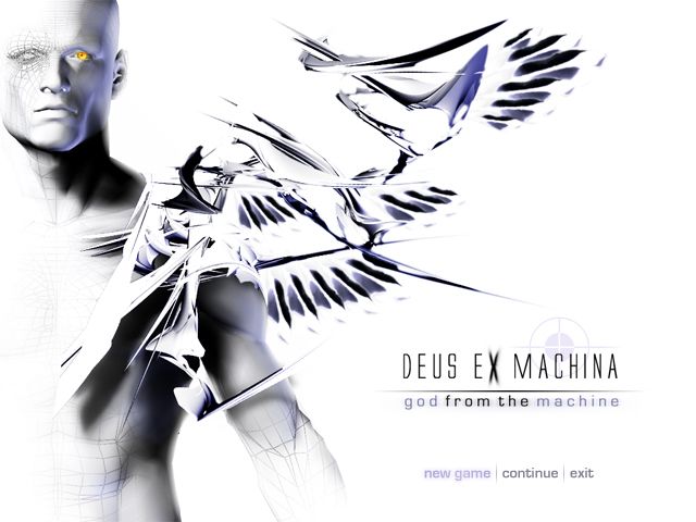
This is the title screen I made for my old RMXP project. It's not too bad, right? I mean, yeah, the title should be the most important thing rather than the winged guy, it doesn't have developer info, and it doesn't adhere to the preferred layout (not necessarily a bad thing per se), but it doesn't make your eyes bleed.
The biggest problem is that the game looked like this:
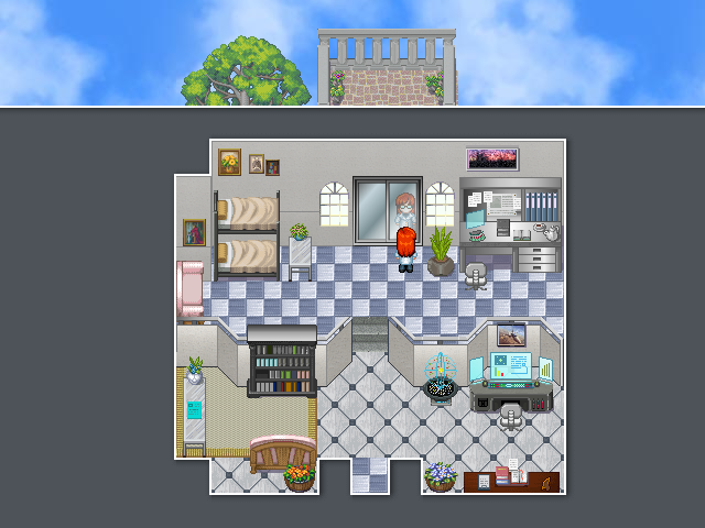
The title screen implies it's some kind of Xenosaga or something (note my inexplicable use of a 3D model in a 2D game), and it sure as fuck isn't. It's RTP with mismatched bits of other things. So you look at the title screen, go "hey this game looks neat," and then it's "where the fuck did the pretty in the title screen go?" It's odd and misleading. Don't do this.
Help, I Don't Know How to Fix My Title Screen
If you want, you can post your title screens here, and I'll critique them. Screenshots of the game itself would also be nice so I have a feel for context. I can be blunt (let me know if the subject's a little sensitive), but I'm not needlessly negative. Other people are also welcome to critique posted title screens.
There are a few things you should keep in mind when making your title screen. It's the first thing someone sees about your game, so it's really important that you make a good first impression.
I can't stress this enough: "making a good first impression" does not involve busting out all of your fanciest Photoshop filters. You want it to look professional, and that involves adhering to some basic design principles. As long as it does that, it's totally fine if it's incredibly simple.
Okay, So Where Do I Start?
There's more than one way to skin a cat, but traditionally, most title screens more or less use the following format:
Now, this would obviously look better if I hadn't knocked it up in Paint in about 30 seconds, but you get the idea of the layout. Most SNES games follow this template, but more recent games sometimes vary a bit more. While you can do other things, sticking with this gives you the advantage of instant recognition that this is a video game title screen and not something else. In any case, there are three things a title screen should have: the title (duh), the new game/continue bit (unless you're handling that differently; for example, FF6 skips straight to the load screen with a new game option at the top), and you should probably include developer information as well.
Do's and Don't's
Some of these are open to interpretation, but I think this is a fair set of general guidelines.
Do not do the following:
- Don't use Photoshop filters. Please don't. Really. They scream amateur, and 99% of people cannot use them well.
- Don't put Japanese characters in your title if your game is not Japanese. Oh god please please don't do this. If you're on this site, your game is NOT JAPANESE (probably), and random Japanese text does not make you cool. I promise. It's like naming all of your characters Seiyu Hatsugura in your game set in present-day America or Standard Fantasyland or something, and it makes you look like a huge weeaboo.
- Don't use a common, ugly font, for example, Comic Sans or Lucida Handwriting or Papyrus. I'd also shy away from things people see all the time like Times New Roman or Arial, but at least those are unobtrusive and not actively obnoxious.
- Conversely, don't use an overly flamboyant font, as they tend to be silly and difficult to read. They also tend to be overused. You want a font that's interesting and distinctive but understated.
- Don't scatter design elements everywhere. Even if you don't center everything, it should follow some kind of order. Putting things in all the corners or something is just going to look bad. Think about alignment and your use of space and all of that.
- Don't use photographs or 3D scenes. A title screen that has zero stylistic relation to your game makes you look like an amateur. Photos always look horrible, and imo 3D renders are also really weird for 2D games. That said, art is fine, assuming it's good. If you're going for a retro atmosphere, a pixeled title screen is recommended.
- Don't put character art in the title screen. The art you draw is for your thread, not for your title screen, even if it's really good. Note that large character art is very rare in the title screens of professional games, although there may be small sprites. The audience will meet your darling main character soon enough, so pick something that represents your game on a more abstract level.
Do do the following:
- Remember that the point of the title screen is the TITLE. Even if you have fancy art or something in the background, the title should be very prominent, and it should be bigger and more attention-grabbing than the rest of the text.
- Make the title screen relate to the game. Any art or symbols or logos or anything should be contextually appropriate. Even if your title screen is very plain, it should at least not show you something the game ISN'T about. If your game is about politics or something, don't put a naked girl in the title. Really.
- Spend some time with the title of the game itself. Font is actually really important, but a lot of people overlook it for some reason. As I said above, it doesn't have to be super-fancy and in fact is probably better if it isn't, but it should look good with the rest of the title screen and fit thematically. If your game is science fiction, don't use medieval script. If your game is dark and serious, don't use a whimsical font. Also, generally speaking, just the game name by itself is a little bland unless you have a really good handle on how to make things look arresting with just fonts. (FF6's title screen is an example of a game with pretty much pure font that looks good.) I am NOT encouraging you to put some kind of fancy Photoshop-generated texture on the font, but think about things like how the text aligns with other elements, for example a subtitle, including underlining, etc. Some kind of small, understated logo integrated with the game name can look good, but please make it tasteful.
- Make your title screen distinctive somehow. You're not necessarily going for something that's mindbogglingly unique here, but it's nice to have some distinguishing elements. You can achieve this by doing interesting things with the font and the title itself (color, pixeling texture, etc.), and you can also add small things for visual interest. However, these things should be representative of your game. Character sprites and bits of map are fine; photographs or 3D models or whatever, again, are not. See the screens below for an idea of what works as far as flavor goes.
- If you don't have a black background, consider framing. There's probably a better word for this, but I don't know it offhand. Anyway, there are a few screens in the examples that do this--put two black bars on the top and bottom--and it usually looks good. It grounds and organizes whatever fancy thing takes up the bulk of the screen.
- Err on the side of minimalism. Less is generally more.
- If you can't do art, attractive minimalism is much better than failing at something ambitious. Be honest with yourself on this one. While this also applies to design, I encourage you not to use things you drew yourself in the title screen unless you've drawn the game's graphics in the same style or you can draw really, really well.
Professional Game Title Screens
These tend to be more elaborate than you're likely to be able to produce (or need, honestly), but you should be thinking along these lines. Before you fire up Photoshop and make your super original Final Fantasy ripoff logo, look at real title screens. I've provided a few for you. Note that I just googled whatever games came to mind, so they're not filtered for content or quality or style or anything. It should be a fairly random sampling of what you're up against.
For some reason most of the screenshots on Google don't have the new game/continue things visible, but whatever, you get the idea.
Dark background, game title, developer info. The title itself has enough visual interest that I guess they decided not to add more things, and it doesn't need them.
Again, except for a couple small details, it's basically just the title of the game and the developer info.
This has stuff going on in it, but the title is still the focal point. Note the color use. The title is orange and yellow--bright, vibrant colors--whereas the background consists of cool blues and teals, which recedes it from the foreground. It's also mostly pretty dark, so it doesn't distract from the title. The part with the metroid and the monitors, the focal point of the background, is not only in the center and brighter, but it's also got more yellow in it, bringing it forward.
This is sort of an extreme example of framing--it has the small band in the middle with the scene and then two large black bars blocking it off. It leaves enough visible to add some visual interest without totally dominating the screen. Again, note that the title is a warm color while the background is a cool color.
The background pattern is interesting but subtle enough that it's not distracting. The title is actually too hard to read, imo.
An exception to the "center everything" and "make the game title the most eye-catching thing" rules, but it works because it's so simple. The pendulum being off-center makes things more dynamic without making the entire thing look off-balance (the fancy C balances it).
The star field is a nice subversion of the usual plain black background. Although the text is dark, the white stroke helps separate it from other similarly-colored elements.
These tend to have more going on than SNES title screens and frequently lack the traditional black background. If you're using graphics that are bigger than SNES graphics and have the ability to make something along these lines, great, but if not, SNES style is probably fine.

Still pixel art, but there's more going on here than you see in the SNES title screens. The title and the elements with it are offset, but they're still centered amongst themselves. Note the effective use of framing.

Like Super Metroid the title is warm against a cool background. The background is light, but the color contrast with the title and low contrast makes it not distracting.

Another Pokemon game. This is older and more traditional than the first one I posted (hi @ centering), but it still breaks the background rule.
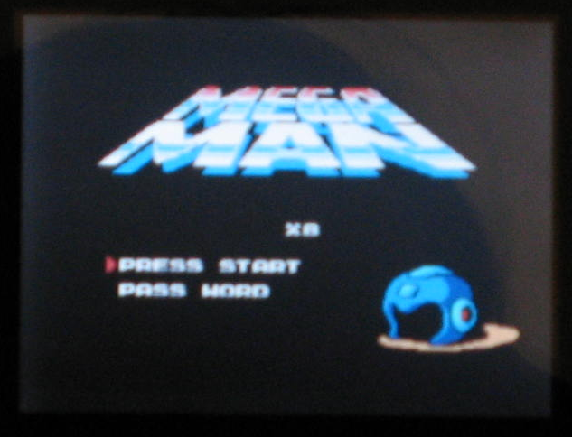
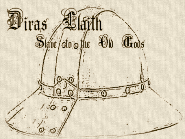
Sorry this is blurry, but the only one I found was a photo. I think this is Mega Man Battle Network 3. It's a nice return to a black background and simplistic design, anyway. It's a bit looser in terms of alignment than SNES games, and the helmet in particular strikes me as GBA-ish--it's more streamlined somehow. Hard to explain.
Uh, this is all I really found, so I guess that's all you get!
Still pixel art, but there's more going on here than you see in the SNES title screens. The title and the elements with it are offset, but they're still centered amongst themselves. Note the effective use of framing.
Like Super Metroid the title is warm against a cool background. The background is light, but the color contrast with the title and low contrast makes it not distracting.
Another Pokemon game. This is older and more traditional than the first one I posted (hi @ centering), but it still breaks the background rule.
Sorry this is blurry, but the only one I found was a photo. I think this is Mega Man Battle Network 3. It's a nice return to a black background and simplistic design, anyway. It's a bit looser in terms of alignment than SNES games, and the helmet in particular strikes me as GBA-ish--it's more streamlined somehow. Hard to explain.
Uh, this is all I really found, so I guess that's all you get!
Good Indie Game Title Screens
You're probably not going to be able to make something as fancy as the above ones, so take a look at what some of your fellow indie game makers are doing. I'd really like more variety here, so any suggestions for additions are welcome.
It should be noted that none of these are flashy. I call them good, but not because they're extraordinarily attractive--I call them good because they work. They get the job done while having good design and conveying a sense of what the game is like.
Cave Story has been a ridiculously successful indie game, and yet the title screen is that minimalistic. It fits with the style of the game, and it gets the point across. I particularly wanna direct your attention to the title itself. There isn't a fancy logo, but see what he did with the line and making the subtitle fit under it. It's not quite perfect, but this is a good example of making the text of the game title interesting without doing heavy modification to the font or adding other things. Text by itself can be very powerful if you use it well.
My favorite RM game. Again, just the title and a small logo. Observe the fact that everything here is pixeled.
This is from 5 Days a Stranger, a point-'n'-click game. It's a good counterpoint to the above two because it's less traditionally SNES-looking, and it breaks a lot of the rules I outlined earlier, such as placement of the title (could be improved) and having a background. It may be ugly, but the game itself is ugly, and it fits in perfectly with everything else. Then the scene itself tells you exactly what the game is about--that house you see there. It also does this neat thing where it segues directly from the title screen to the intro, as I recall. So you wouldn't mistake it for a professional game, but the guy who made it worked with what he had, and the design itself is more or less chosen well.
I seem to remember Quintessence having an interesting title screen; Reives used an actual animated game map, which is both neato and actually representative of the game itself. That said, I seem to recall poor font choice and homemade character art and some transparent things (imo transparency is really ugly in RM games), so it's not a perfect example.
Bad Indie Game Title Screens
Most of these are from VAA threads that are years old, so hopefully I won't be hurting anyone's feelings by talking about them.
The text is hard to read, first of all, but the placement isn't bad. The biggest problem with this is that it has tons and tons of filters. It screams, "I'm compensating for my ugly RTP game with a title screen as convoluted as I can make it." It's way, way too busy, and it reeks of Photoshop.
The title should be the first thing your eyes go to, and instead it's the knight dude in the upper right corner. For some reason, the title is small, dark, shunted over to the left, and Lucida Handwriting. Lucida Handwriting is one of those ugly default fonts that come with your computer, and a game title should have bold, instantly readable letters, not wispy script. At least the background is mostly black, but the accents are white, which contrasts a lot with the background. The blurry things are ugly and messy-looking and at odds with the crisp font, and their placement is random instead of aligning with the other elements, which makes the entire thing look sloppy and disjointed.
This actually isn't that bad--the background texture is subtle, and there isn't an absurd amount of detail. The font is hard to read, though, and the text blends into the helmet too much. The text also doesn't form one cohesive unit very well.
I, uh, I think I'll let this one speak for itself.
And finally...
This is the title screen I made for my old RMXP project. It's not too bad, right? I mean, yeah, the title should be the most important thing rather than the winged guy, it doesn't have developer info, and it doesn't adhere to the preferred layout (not necessarily a bad thing per se), but it doesn't make your eyes bleed.
The biggest problem is that the game looked like this:
The title screen implies it's some kind of Xenosaga or something (note my inexplicable use of a 3D model in a 2D game), and it sure as fuck isn't. It's RTP with mismatched bits of other things. So you look at the title screen, go "hey this game looks neat," and then it's "where the fuck did the pretty in the title screen go?" It's odd and misleading. Don't do this.
Help, I Don't Know How to Fix My Title Screen
If you want, you can post your title screens here, and I'll critique them. Screenshots of the game itself would also be nice so I have a feel for context. I can be blunt (let me know if the subject's a little sensitive), but I'm not needlessly negative. Other people are also welcome to critique posted title screens.


