Envision, Create, Share

Welcome to HBGames, a leading amateur game development forum and Discord server. All are welcome, and amongst our ranks you will find experts in their field from all aspects of video game design and development.

Why Your Title Screen Is Ugly and How to Fix It

mawk":3eo5dexd said:
shaky font + tribal pattern + underline + hell of bubble brushes + glow can hardly be called simple.
Well if you want to pick it apart like that...
For me the bubbles, the underlining, the tribal are kinda one unit. It doesn't distract from the text really. There could be a lot more other images, colors or symbols going on in that image, that's why I would call it simple.
I only see the title and then the options. That is 2 things, so simple for me.
It depends on your definition of "simple". I didn't notice see the glow really until you metioned it, that's how low key it is to me.
 
mawk":33crtbtk said:
it's good "for fifteen minutes of effort" but it could stand to be so much better with a little more/little less/the exact same amount of effort. all the problems I have with that title screen involve the size and positioning of the words, and the presence of extra stuff you've apparently gone an extra few steps to throw in there.

it's a bad habit to make excuses without planning to fix anything.
Taking time to work on a mediocre title screen to make it slightly less mediocre is hardly a bad habit. I consider it a worse habit to constantly refine and tinker with your work and never allowing yourself to be satisfied and move on. Also working in the favor of mediocrity is the fact that there is a huge acceptable middle ground for title screens. Unless it is exceptionally bad (or exceptionally good), most players just gloss over the title screen. Obsessing over the look of the titlescreen is akin to obsessing over the music that plays during the titlescreen (which the player will hear all of 10 seconds of).

And I found my .psd file for Chronology.

The font is from Dafont (Creator Campotype SMCP). It has the default Inner Shadow effect, dafault colored Outer Glow at 75% opacity @ 5px, and a 1pt reddish Stroke. The image is from a search on "Clock .png" (iirc) on Google images, and other than a bit of cropping, is completely untouched.

I tried playing around with the font sizes for Chronology Of, but it ruined the effect of negative space around it. Reducing the glow tended to make the font look especially pixelated which stuck out like a sore thumb compared to the larger font and the clock dial. Moving the words The Last Era up a few pixels did look better, though, and removing the crazy circle things was more of a lateral move (didn't really improve or detract from the image in my mind). I tried different fonts on my machine, but none looked any better. I'd have to go to Dafont and search again.

chrono2.png


I'm pretty bored this afternoon, and am willing to putz around with this if anyone has specific suggestions.

EDIT:
Putzing #1:
chrono3.png
 
it's a bad habit to make excuses without planning to fix anything.

Isn't an even worse habit to constantly revise your work over and over again to accommodate someone else's objective standards of 'excuses' and 'needing to fix it'?
 

mawk

Sponsor

kentona, that's miles and miles better. the way you had the text aligned before, it broke up the flow midway without reason, but this reads nice and clean, and the focus is brought in nicely by the brightly-coloured totle. you didn't necessarily have to choose a simpler font, but this one works great.

Feldschlacht IV":2ptv34ml said:
Isn't an even worse habit to constantly revise your work over and over again to accommodate someone else's objective standards of 'excuses' and 'needing to fix it'?
I don't see anyone coming close to revising their work over and over on my word alone so, while true, that's entirely irrelevant.

p.p.s. it looks sort of berkish to mistake critique for a personal attack, especially when you're just a third party. no one here needs defending, and as far as I see there isn't much to get hung about, so let's all be friends.
 
Whoops, meant to say 'subjective'.

p.s. I don't see anyone coming close to revising their work over and over on my word alone so, while true, that's entirely irrelevant.

No, I wasn't applying what I said to this situation, but still applies in general, right?

p.p.s. it looks sort of berkish to mistake critique for a personal attack, especially when you're just a third party. no one here needs defending, and as far as I see there isn't much to get hung about, so let's all be friends.

I didn't mean to insinuate that I took the critique personally. My bad! However, I want to safeguard against the mentality that sometimes occurs when people critique things that goes something like this sometimes.

Guy 1: Hey can you tell me what you think about this painting?

Guy 2: Well, I think you should do this, this and this.

Guy 1: Hmm...I appreciate the critique, but I have to disagree! I think it's not too bad how it is.

Guy 2: SOUNDS LIKE YOU'RE JUST MAKING EXCUSES

I'm not saying it's happening here (it isn't!), but it happens though!
 
mawk":2y2cs1tj said:
shaky font + tribal pattern + underline + hell of bubble brushes + glow can hardly be called simple.

In all honesty, it's basically hard round brush and eraser tool and a line tool :P
The glow is there for it to stand out from the bg, specially when clouds are moving about
 
I've been thinking about it, and I've decided that railing on RM games for using art in the title screen is silly. Ideally it should be pixeled, but most RM games have drawn elements, e.g. portraits, battlers, battle backgrounds, panoramas, animations. Photos and 3D renders and stuff are still no-nos, though. I should update the first post to that effect.

I've also decided pure black backgrounds look a lot better when everything is pixeled, so I should update the first post with that too.

@Ynlraey:

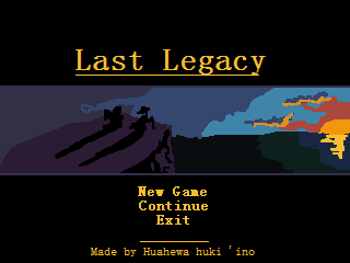
#1: I find it odd that the start/load/exit text is the same size as the title. Your logo is also weird. You have these solid circles and then a wispy glyph thing in the middle that's a lot glowier than the circles. I actually do quite like the circles. My suggestion would be to lose the wispy thing, anchor the circles on the right more strongly to the rest of the logo, and pick a stronger font. Thick, straight lines and smooth curves to match the solid presence of the circles.

The picture looks like you just scaled down the luminosity, also; you should go for more brightness/contrast adjustments and play with the curves or something to make it dark and vibrant instead of wan and gray. Also, try adding some black to the top and bottom. Might make it pop out more.

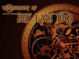
#2: Title and new game/continue/exit look too similar--I would make the latter smaller and pick a different font, honestly--and the tribal glyph thing isn't working for me. The part where the text overlaps it looks messy, and it's painfully obvious it's just a vector or something with an outer glow. It doesn't have weight or substance. Does the tribal pattern actually relate to your game, by the way? If not, I would strongly suggest doing something else, because tribal patterns are really overused. For example, a lot of people get tribal tattoos just because they think they look cool without actually understanding the meaning.

The font is really overused, btw, and I feel like the title itself needs something more. Like, you probably do want to have some kind of logo or grounding elements with it instead of just text. Text + a fancy texture on its own does not a nice title make; exercise a bit of design. By the way, I dislike fancy textures, because they're often used as substitutes for good design.

Those issues aside, both of these are pretty decent. You could make them stronger, but they don't look bad as they are.

@Lune de la Cruor: I was trying to showcase good design that doesn't rely on being flashy or arresting to achieve its purpose. Those title screens aren't breathtakingly beautiful or anything, but they're very consistent with their respective games. They get the job done, and they fit. I probably should've stressed that more by linking screenshots so you can see how it all kind of ties together, because title screens shouldn't exist in isolation of their games. Like, the point I was trying to make wasn't that those were the absolute pinnacle of what a title screen should be, although I realize it sorta came off that way in retrospect. It was like, hey, here's something that works without being really elaborate.

At the 2nd I don't even know what the title is...that wierd symbol above the text caught my eye again, I am assuming it's not the title.
The title is Yume Nikki, and the logo thing is presumably a maze, which relates to the game. You explore a little Japanese girl's twisted nightmares, which are often quite mazelike.

There probably are better examples out there, but those were the title screens I could find, and again, I wanted to emphasize that you can make a good title screen that isn't flashy. As far as pixel games needing a pixel title goes, that is absolutely true. There's more wiggle-room with games that aren't pure pixel, though, and like I said at the beginning of this post, most RM games fall into that category.

@kentona: As I said in the first post, a title screen is the first thing someone playing your game sees, and it needs to make a good impression. That doesn't mean it needs to be flashy or take a lot of time; it just needs to look good. It's like anything else in game-making. You can take a casual, slapdash approach to it and churn something out, but you probably shouldn't if you want to impress.

I agree with mawk, although I probably would've put it a bit more gently. The big issue here is not that people lack spriting or Photoshop or font skills; the issue is that they lack design skills. They lack a discerning eye to tell what looks good and what doesn't. It's a skill you have to learn like any other, but you can work on it by studying professional examples and trying to discern what they have in common.

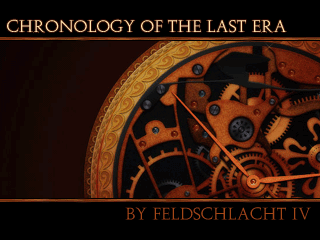
@kentona again: The new version of that title screen is a hell of a lot better than the old one. You can actually read the damn text now, the font is no longer silly and overly ornate, and the black bars are classy. That actually looks quite nice. Feld picked a nice piece of art, my quibbles about using art in RM titles aside.

Couple nitpicks if you feel like continuing with it, though. You did good by making his name darker than the title, but it should be smaller, too. Also, the title starting on the left and not quite going all the way over to the right is weird. Either it should be right-aligned to match the clock, centered because you center things in title screens, or go all the way across the top of the screen there. Hmmm. I'm actually not sure changing the alignment would be an improvement, because I'm not sure it wouldn't look too unbalanced for a title screen, and the current design leads the eye from the title down the hand of the clock and to your name. Which probably wasn't intentional but is interesting. If you justify it, anyway, space the letters, don't make the font bigger. Maybe a little, but not a lot. Or make it bigger and make the bars bigger to match and move the clock up so you still see the center. Dunno, just tossing out ideas.

@Feldschlact:
Isn't an even worse habit to constantly revise your work over and over again to accommodate someone else's objective standards of 'excuses' and 'needing to fix it'?
That's a terrible excuse for ignoring constructive criticism, and I'm a little insulted by the implication that listening to us is somehow enslaving yourself to our opinions. There is a huge difference revising your work based on careful consideration of points people bring up and mindlessly trying make everyone else happy. It's a little off-putting when someone asks you for criticism and then ignores it, but obviously constructive criticism should always be taken with a grain of salt, and I'm certainly not one to force people to change their stuff when they like it fine as it is. To my mind, your title screen needs work, but if you're happy with it and don't care what other people think, that's all that really matters.

@mawk: ilu broseph :3333
 
That's a terrible excuse for ignoring constructive criticism, and I'm a little insulted by the implication that listening to us is somehow enslaving yourself to our opinions. There is a huge difference revising your work based on careful consideration of points people bring up and mindlessly trying make everyone else happy. It's a little off-putting when someone asks you for criticism and then ignores it, but obviously constructive criticism should always be taken with a grain of salt, and I'm certainly not one to force people to change their stuff when they like it fine as it is. To my mind, your title screen needs work, but if you're happy with it and don't care what other people think, that's all that really matters.

No no, I'm not implying anything on you guys! I'm just saying that I've seen a lot of the aforementioned attitudes in other discussions such as this.

I apologize!
 
Okay, that's fine, then. :3 That does tend to happen sometimes, but I hope it won't happen here.

Also, I updated the first post, mainly the do's and don't's. I changed my mind on a few things after seeing a few RM title screens that I decided weren't half bad.
 
Well, when I first saw this thread, I thought "how pretentious," but you ain't being pretentious at all--you're being pretty helpful, so sure, why not? My characterizations might be refined, but I have no sense of visual design. Though I'm sure you can tell that from how impossible it is to see my title at a glance.

Hit me, dearie, just... not too hard.

1-11.png
 
Kuahewa huki 'ino":2qs67agp said:
Well, when I first saw this thread, I thought "how pretentious," but you ain't being pretentious at all--you're being pretty helpful, so sure, why not?
Haha, yeah, I deliberately picked an incendiary title to get people in here. "Title Screen Fundamentals" just doesn't have the same impact, y'know?

Hit me, dearie, just... not too hard.
All right, sweetheart, I'll try. :3

The first thing I wanna say about this is that you really shouldn't use concept art for your title screen. This style would be fine if the entire game looked like this, but that's uncommon enough that I'm gonna assume you're not doing that. While using art in title screens is fine for most RM games, it has to look like the other art in the game--panoramas, battle backgrounds, etc. Also, you actually almost never see the main characters of games take a big role in the title screens of professional games, presumably because you're gonna meet them soon enough anyway, although I like that you have them facing away from the camera. I recommend sticking with landscapes or objects for the most part, and if you want to use art, you probably want to shop around for a while to find something that's in the style you need.

The title shouldn't be that small, by the way. You want it big and on the top, preferably but not necessarily centered. Writing it on instead of using a font fits with the style of the art, at least, but again, I recommend you not use the art.

Your windowskin is also a little garish; it draws attention to itself instead of the text. I'd pick something more understated. By the way, if you want to get rid of that selection box, ccoa made a script that lets you use three images (one for new game highlighted, one for continue, and one for shutdown) around here somewhere. It's probably floating around here somewhere. There are probably other title screen scripts, too.
 
Ok I'll fix it after I understand what it means, my english is really...not that good. While I disagree that I should change the Morpheus Font, considering it's the only decent font for the specific genre I'm aiming for, I'm not going to change it to something unreadable or not fitting for the game's theme, (I am looking at you HADRIAN) I just hope the overuse-ness of it won't affect the perspective for the game :D

I didn't use any photograph but I did use a brush and seriously just lowered the opacity for it and I'll remove the wisp thingy (even tho I like it) if it's that disturbing and makes the image unbalanced.

I am debating in my head about the size of the options, one thing is that, making them too small might make the mouse select it a lil bit...harder. As much as possible I want to make it easy to point and click

As for the second one, yes I can see why you don't like it :)
 
I really think you should change the font--I'm sure if you looked around enough, you could find something--but it's up to you. And, yeah, I absolutely don't encourage something unreadable or inappropriate. I would actually suggest something less ornate than that. It's a little gaudy, imo.

I know you didn't use a photo, by the way, but I still think the pic needs more oomph. The wispy thing doesn't make it unbalanced, but it doesn't match the other more attractive parts of the logo, so I say dump it.

One thing you could do about the options is make them smaller but space them out and have them be selected when the mouse is in the general vicinity. They really shouldn't be the same size as the game title. You could stand to make the game title bigger, but not enormously so, so I think the options should shrink.
 
Points noted. I really should be better with the title positioning and size; at the time, a signature-style thing seemed like a good idea. Hindsight is 20/20 and all that.

I guess people don't care much for the windowskin. Interestingly enough, if I'm given the option personally, I make my windowskins colored like this in every game I play because I am, obviously, a huge jerk--this is FF7's fault and was only reinforced by Star Ocean 2. Maybe in the final product (hah! Someday), I'll toss in a few more demure, alternate skins and detail how to change it quick and dirty-like.

Perihelion":2us9sbw3 said:
While using art in title screens is fine for most RM games, it has to look like the other art in the game--panoramas, battle backgrounds, etc.
Wise words, but in this case: no, actually. Since animation is far more trouble than it's worth, stills drawn and colored like the one used in the title, except with dialogue overlaid, are what I'm using in place of DRAMATIC FMVS and not so uncommon so I wonder if, that being the case, this is actually appropriate.

Sure, the bulk of the game is RTP, but it's not like drawings such as that never appear in the game... and yes, it saves a bit of time scripting movements and clever pauses and whatev' at the exchange of scratching these out.

I'll definitely look into the more streamlined look of not having a windowskin on the title screen. If I move the title, I'll definitely have some convenient empty space in the corner. Thanks, good sir.
 
Wise words, but in this case: no, actually. Since animation is far more trouble than it's worth, stills drawn and colored like the one used in the title, except with dialogue overlaid, are what I'm using in place of DRAMATIC FMVS and not so uncommon so I wonder if, that being the case, this is actually appropriate.
That'll clash, but it's better to have a game that's done than a game with beautiful, consistent graphics. In that case, I suppose it wouldn't be horrendously inappropriate if you want to go that route, but I think you would benefit from revisiting the art. Like, the characters should be receded more, and you should unify the palette more. If it's sunrise or sunset, everything beyond the immediate vicinity of the sun is going to be purple/blue/gray, and everything around the sun is gonna be purple/red/gold. Including the grass, water, etc. I'd say you're also gonna wanna get some hard critique on it and make it the best you can, since it's for the title. Head over to Visual Art Analysis, maybe.

I can see you doing something along the lines of Secret of Mana. This was the first thing that popped into my head:

lastlegacy.png


Now, this was 10 minutes in Paint, and obviously you can do a lot better--the design as it is now needs a lot of work, the font was the first thing I randomly selected that didn't make my eyes bleed, etc. The colors around the sunset/sunrise aren't very good, but I was too lazy to fix them. You get the idea, anyway.
 

mawk

Sponsor

MAYBE I CAN

Selwyn, that's simple and very functional, but it's also a little dull. the main colours (white for the title, dull blue for the background) don't have a lot of contrast between them, so while it's easy to identify the title, nothing really pops out at the viewer. the design behind it is also pretty tough to make out. while I really admire the minimalistic style, I'd maybe darken the background colour a little bit so that the white stands out against it a little more.

then again, I am colourblind, so I'm not the end-all be-all of assessing colours and how they go together.

LegacyX, you're on your own far as I'm concerned because I can't stand Hanzo Kimura and his terribly facile title screens. it's not as if it'd accomplish much anyway, since it's not yours and Hanzo tends to ignore outside crit
 
Thanks for your critic Mawk!
It does look a bit dull indeed, and I've had a few ideas for a possible background but nothing came out good so I'll leave the background like that for the while.
And it's actually a bit hard to make out the details because it's been resized down for the critisism. I found that a resized down screenshot of any game should ideally have the same effect of its fullsize counterpart.
If the smaller version works alright, then the bigger and more detailed version should logically look better (not always the case though).

Here's the full version:
titleo.png
 

Thank you for viewing

HBGames is a leading amateur video game development forum and Discord server open to all ability levels. Feel free to have a nosey around!

Discord

Join our growing and active Discord server to discuss all aspects of game making in a relaxed environment. Join Us

Content

  • Our Games
  • Games in Development
  • Emoji by Twemoji.
    Top