

Section 1: Intro to Mapping
When mapping, it's best to always start small and expand as you go. Say you're making a castle: Start with the front, and the drawbridge. When you're happy with that, expand a little upwards, and add the roof and/or the rest of the castle (those things are tall!) As you go on, feel free to add a small forest, fields, a garden, a cave, anything.
If it's your first time mapping, start with the size given to you (20x15), but realize that that size is really only appropriate for interiors and intimate spaces (places for important conversations, where something takes place, etc etc.) I generally make all of my outdoors stuff start at 40x40. It's a good size without being too overbearing.
Don't expect a masterpiece the first or even the 50th time you make a map. Mapping takes luck, skill, and some amount of talent and imagination.
Practice makes perfect! If you've stepped away from map-making, you cannot expect a grande masterpiece on the first go.
Mapping takes time. It is definitely possible to make an awesome 20x15 map in under 10 minutes, but it's mostly luck and expertise. Plus, that 20x15 map really isn't going to get you very far - it's just too small for most purposes, plain and simple. Decent-sized maps (I'm only talking maybe 75x75 here) should take around a half hour more - and the time only goes up as your map increases in size.
Also, if you're brand new to mapping, get some inspiration first. Go to Google and just look up "[whatever game] screenshots" or just perhaps, "hillside." "Castle." Whatever. Googlemaps is actually a great resource; by looking at an aerial view of...well, the world, you can see how different cities are laid out, how rivers run, etc.
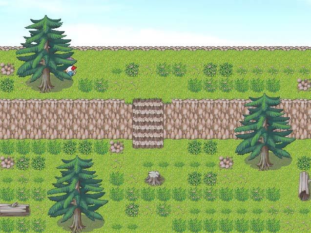
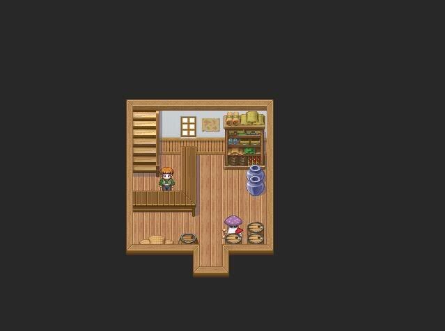
The farm interior is a lot harder to map that it looks.
When mapping wilderness, the first step is always to put down a layer of *something*. Grass, water, marsh, whatever. And it always goes on the first layer, no exceptions. Basically, anything that fills up an entire square can and should be put on the first layer - it allows for much greater detail later. Next, figure out what, if any, landmarks you want. I generally like to include a river or creek in at least one of my maps. If you decide to put a creek in, make sure that either the player can get across to the other side, or that you have a good reason for not letting them (i.e., that shiny chest over yonder that they're not allowed to get 'til later.).
Please remember to keep a good reason in mind for most things you place on your map. Why did you put a million tiny puddles/ponds in your forest? "Just because" really isn't a good answer, and it tends to make the map look worse for it. "Because the forest is filled with depressions left from giant creatures and they collect rainwater for the locals" is a much much better reason and makes the map make sense (just make sure the player knows why, too.)
Having a lot of rivers makes a map more fun and interesting, but remember that they have to start from somewhere. At some point, if you do each map as a piece of a whole, there ought to be a mouth of a river somewhere. Rivers are fed indirectly by the ocean - tiny fingers lead from the ocean to a big lake, which then feeds the appointed river.
More often than not seeing two rivers near each other is because one is a branch of the other.
But, keep in mind that your game (statistically speaking) will probably be based in fantasy. If continents can fly in the air, then by golly rivers can start on top of mountains. I'm just saying you should be aware that stuff like that doesn't happen in real life. Explaining how or why something is the way it appears in your game can add a lot more depth.
But with that said,
Waterfalls must gravity. Don't try to put a waterfall in the middle of a map without a cliff behind it! It's more understandable to not have a cliff if you just use teensy ones in a creek - those are extremely common and arise from small changes in the riverbed. But anything bigger than one tile and you need a cliff! The autotile itself proves this - the sides of it correspond to cliff edges.
Likewise, however, make sure the waterfall is actually FED by something. Waterfalls don't just sprout from nothing! If it's coming off a big tall mountain, it's probably fed by melting snow. If it's going into a valley, it's probably fed by a river or lake.
Mountains, cliffs and other riffraff ought to be *mostly* asymmetrical. Why? Because symmetry is a man-made invention to make things stand out. (Yes, I realize that nature does have *some* symmetry. But it's not very much.)
The symmetry that I'm talking about refers more to excess symmetry moreso than general symmetry, and most especially vertical/horizontal moreso than diagonal. In a medium such as this where there's only so many ways you can do something (due to the 32x32 grid) it's nearly impossible to completely avoid some amount of symmetry. (OMG there's a plant on the same row 234 blocks across! :huh: )
On that note, do things in 3's. Why? Because even though symmetry should be avoided, the eye tends to ignore triangular patterns unless it's specifically looking for one. Lines will always stand out more. And also, it's just simply more aesthetically pleasing.
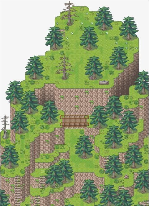 <-Decent example.
 <- Not so great example. WHY IS EVERYTHING IN LINES!? Is it a mountain/weed army?!
Details
Always try to make a map visually interesting, and if not interesting, at least make it noteworthy. Have something interesting happen there (Remember Toma's gravefrom Chrono Trigger? Do you remember that map? Literally all it was was a panorama, a teensy bit of cliff, one tiny rock and the grave. But the act of pouring soda on the grave was what made it noteworthy.)
If you're going to be asking for critique on the map, though, let us know what's going on! Don't assume that anyone knows that your ultra-awesome mega death scene takes place there. If it's boring, we're going to call it like we see it.
There is, however, such a thing as adding too much. Too many piles of grass, too many flowers, too many trees. Trees need space to grow - though some do grow close, if you've ever been in a forest you'll know that not only can you just about always fit between trees (even if you're on a bike or obese), but that double trees tend to be just that - trees that were so close that they grew together (or one tree that split). Most flowers can only grow where there's a decent amount of sunlight - that's the reason snapdragons tend to line paths instead of being everywhere in the woods - so don't go putting in bunches of flowers underneath a heavy patch of trees.
HOWEVER. Trees tend to look better, at least in RMXP, when they're placed fairly close together. Not *on top* of one another, but fairly close. Enough to make a barren field look like a dense forest or a lush jungle. Use layers to your advantage.
The "shadow grass" autotile is a godsend. While it is, technically, a "shadow," it can be used most anywhere just to add a tiny bit of detail to your map. I do, however, suggest that you don't use it too much in w~i~de open spaces.
Don't feel the need to be constrained by autotile usage just because of its name - for instance, I humbly believe that 030sn_ground01 (the snowy "ground" autotile) works marvelously as a frozen over creek - much better than the ice autotile the game gives you. However, whatever you decide to use an autotile as, don't use it as anything else -it'll just confuse players. The dirt autotile, however, is perfect for both beaten path and....well, beaten anything. Town square? Use it. Pig sty? Use it. Dry farm town? Use it. What exactly is the grass hanging onto in the middle of a serious drought? Answer: Not much, and by the time the cows have eaten most of it it's buh-bye grass and hello dustbowl.
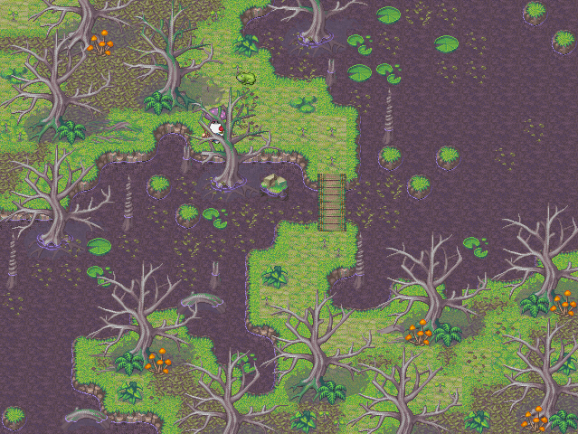
I'll tell you a secret: This is the first time I've ever mapped a swamp that I didn't think was terrible to the nth degree. So, take a look at it: I've noticed that in gross, swampy water, there's always stuff in/on it - leaves, bugs, lily pads, algae, etc. Notice also that I've used the fallen leaves autotile: It seems counterintuitive, since the trees have no leaves that could fall (and look quite, quite dead), but I figured that that was probably the leaves of yore as well as the other plant life, fungi, mildew, other gross stuff..... But note that it's mostly centered around the trees themselves, mostly because the mapping doesn't allow for it to go right next to the water but also because in the event of a heavy rain, the water would just wash it away anyway.
Panoramas
Basically, if you can see it on a flat grass map, you're doing it wrong. Remember that you're looking at the earth from a...eh, 45 degree angle or so. I'm ever so slightly against using it on an ocean map, but perhaps on a beach where you can't go anywhere else it would be ok. The only reason for seeing it is because...well, you can't go any farther. There's a drop. You're on a bridge. You're in the air. If it's flat, you can't see it, and thusly your chosen ground should cover the entire map.
Houses
Remember these two factoids: On farms, houses are built almost wherever you please, because they're on a farm and generally set away from the main road. In a town or city, houses are generally set right near the road, and tend to be in a row. Cities are made to cram as many people in as they can, because that's where jobs are (post industrial revolution). So to deal with housing, houses are built cheaply (except for the owners of the factories, but I'll get to that in a second) and are packed together. This is what makes a city stop being a tiny nothing and become a city. Businesses and people. Towns are the same but on a smaller scale. Fewer businesses, more spaced out houses. And if you go to some booming international cities, you'll see even *more* people crammed into tiny spaces. So, if you're following this logic, houses out in the middle of nowhere can be HUGE, while houses in the city can be no bigger than a single sad room.
By Final Fantasy (and most other RPG's) logic, a good town is 2-3 houses, a shop, an inn, and one or two other specialty buildings. Keep this in mind - while it may not be everyone's cup of tea, it cuts down on clutter and the amount of maps (and time!) you need to spend on each town.
As for rich people: Yes, their houses are always bigger. They don't need to work for a few cents each day to buy bread, so their houses are understandably in nicer sections of town, set apart from the hubbub of factory and city life. They may have bigger yards, but then again they might not, and still be squeezed together to make more space for more rich people. The really really rich people get a spot all their own, with space for whatever they need.
Outer structure in cities tends to be the same, or very nearly the same. People can and do, however, change original structure, so unless it's a brand-new city, plan for that. Most people don't move the doorway around, however. This is where being able to recolor and/or custom pixel works in your favor, but it's not necessary.
Yards
Houses can have small yards, big yards, no yards, fenced-in yards, open yards, but if they have yards you can always tell. There's never just houses placed willy-nilly on an open field. Houses with no yards tend to either: a) Not be houses at all (they're apartments), or b) They're inner-city dwellings with no room for a yard. And farm houses, while they may be randomly placed on a field, they're randomly placed on THEIR OWN LAND are generally separated by *something* (a road, a fence, a river, etc [if you look at farmland on an aerial view you'll see what I mean). If you have houses set randomly with no boundaries, you'd better have a good reason ("We don't believe in private property here.")
Other
**THIS IS IMPORTANT!!** If you have a path on your map, that means that the grassy/wooded area it came from has been trampled enough times to create a clearly marked place to walk. That means that if you have long grass growing around, it shouldn't be on that path. If it is, it shouldn't just be on the path and nowhere else. Likewise, your entire map should NOT be covered in little bitty baby path squares that go nowhere.
If you have a big trade town, for the love of god don't put a town square right in the middle of the road! How are people supposed to get in and out with their goods?!
On Using the Canopy Autotile
Quite frankly, I don't like it. I think (like most tiles in the RTP) it has potential, but the good folks behind RMXP just came a few coconuts short of a pina colada. Basically, the biggest issue with the tile is that it's square. What trees do you[/u] know (besides hedges...) that are square?
I find that it *can* be used, in a pinch, for decent bushes, but if you're really gung-ho about using it on your map I find that there's really only one place for it: The bottom of the screen.
 *Note: This is not a great map. It's used simply to illustrate another possible way to make a forest path, this time using the canopy autotile.
Now, I'm sure you've seen maps that use this autotile at the top of the map as well as the bottom. YES, it's possible to be used in that way, and if you've played Chrono Trigger, you've seen it at its best. This, however, is not its best. The RMXP RTP will never be anyone or anything's best. The issue with putting it at the top of the screen, put simply, is this: Given that you're looking at the map at a 3/4 angle, you should be able to see everything that that canopy is rooted in, ie tree trunks. However, in order to build an impressive (and decently realistic) forest, you need lots of trees, placed in different spots. To do that, you need to use different layers, specifically here layers 2 and 3. If you're keeping track at home, you'll realise that that doesn't leave with you with a layer for that lovely, hideous autotile...
So you're left with not using tree trunks at all, and having quite honestly a ridiculous looking map, or using tree trunks in straight lines not touching each other so that they're all on layer 2. :/
I've found it best simply not to use that tile at all, but I will admit that it's damned helpful. It marks the boundaries of the map, and it keeps the player from exploring too far into unmapped territory. Now if it wasn't so square...
Please remember to keep a good reason in mind for most things you place on your map. Why did you put a million tiny puddles/ponds in your forest? "Just because" really isn't a good answer, and it tends to make the map look worse for it. "Because the forest is filled with depressions left from giant creatures and they collect rainwater for the locals" is a much much better reason and makes the map make sense (just make sure the player knows why, too.)
Having a lot of rivers makes a map more fun and interesting, but remember that they have to start from somewhere. At some point, if you do each map as a piece of a whole, there ought to be a mouth of a river somewhere. Rivers are fed indirectly by the ocean - tiny fingers lead from the ocean to a big lake, which then feeds the appointed river.
More often than not seeing two rivers near each other is because one is a branch of the other.
But, keep in mind that your game (statistically speaking) will probably be based in fantasy. If continents can fly in the air, then by golly rivers can start on top of mountains. I'm just saying you should be aware that stuff like that doesn't happen in real life. Explaining how or why something is the way it appears in your game can add a lot more depth.
But with that said,
Waterfalls must gravity. Don't try to put a waterfall in the middle of a map without a cliff behind it! It's more understandable to not have a cliff if you just use teensy ones in a creek - those are extremely common and arise from small changes in the riverbed. But anything bigger than one tile and you need a cliff! The autotile itself proves this - the sides of it correspond to cliff edges.
Likewise, however, make sure the waterfall is actually FED by something. Waterfalls don't just sprout from nothing! If it's coming off a big tall mountain, it's probably fed by melting snow. If it's going into a valley, it's probably fed by a river or lake.
Mountains, cliffs and other riffraff ought to be *mostly* asymmetrical. Why? Because symmetry is a man-made invention to make things stand out. (Yes, I realize that nature does have *some* symmetry. But it's not very much.)
The symmetry that I'm talking about refers more to excess symmetry moreso than general symmetry, and most especially vertical/horizontal moreso than diagonal. In a medium such as this where there's only so many ways you can do something (due to the 32x32 grid) it's nearly impossible to completely avoid some amount of symmetry. (OMG there's a plant on the same row 234 blocks across! :huh: )
On that note, do things in 3's. Why? Because even though symmetry should be avoided, the eye tends to ignore triangular patterns unless it's specifically looking for one. Lines will always stand out more. And also, it's just simply more aesthetically pleasing.
Details
Always try to make a map visually interesting, and if not interesting, at least make it noteworthy. Have something interesting happen there (Remember Toma's gravefrom Chrono Trigger? Do you remember that map? Literally all it was was a panorama, a teensy bit of cliff, one tiny rock and the grave. But the act of pouring soda on the grave was what made it noteworthy.)
If you're going to be asking for critique on the map, though, let us know what's going on! Don't assume that anyone knows that your ultra-awesome mega death scene takes place there. If it's boring, we're going to call it like we see it.
There is, however, such a thing as adding too much. Too many piles of grass, too many flowers, too many trees. Trees need space to grow - though some do grow close, if you've ever been in a forest you'll know that not only can you just about always fit between trees (even if you're on a bike or obese), but that double trees tend to be just that - trees that were so close that they grew together (or one tree that split). Most flowers can only grow where there's a decent amount of sunlight - that's the reason snapdragons tend to line paths instead of being everywhere in the woods - so don't go putting in bunches of flowers underneath a heavy patch of trees.
HOWEVER. Trees tend to look better, at least in RMXP, when they're placed fairly close together. Not *on top* of one another, but fairly close. Enough to make a barren field look like a dense forest or a lush jungle. Use layers to your advantage.
The "shadow grass" autotile is a godsend. While it is, technically, a "shadow," it can be used most anywhere just to add a tiny bit of detail to your map. I do, however, suggest that you don't use it too much in w~i~de open spaces.
Don't feel the need to be constrained by autotile usage just because of its name - for instance, I humbly believe that 030sn_ground01 (the snowy "ground" autotile) works marvelously as a frozen over creek - much better than the ice autotile the game gives you. However, whatever you decide to use an autotile as, don't use it as anything else -it'll just confuse players. The dirt autotile, however, is perfect for both beaten path and....well, beaten anything. Town square? Use it. Pig sty? Use it. Dry farm town? Use it. What exactly is the grass hanging onto in the middle of a serious drought? Answer: Not much, and by the time the cows have eaten most of it it's buh-bye grass and hello dustbowl.
I'll tell you a secret: This is the first time I've ever mapped a swamp that I didn't think was terrible to the nth degree. So, take a look at it: I've noticed that in gross, swampy water, there's always stuff in/on it - leaves, bugs, lily pads, algae, etc. Notice also that I've used the fallen leaves autotile: It seems counterintuitive, since the trees have no leaves that could fall (and look quite, quite dead), but I figured that that was probably the leaves of yore as well as the other plant life, fungi, mildew, other gross stuff..... But note that it's mostly centered around the trees themselves, mostly because the mapping doesn't allow for it to go right next to the water but also because in the event of a heavy rain, the water would just wash it away anyway.
Panoramas
Basically, if you can see it on a flat grass map, you're doing it wrong. Remember that you're looking at the earth from a...eh, 45 degree angle or so. I'm ever so slightly against using it on an ocean map, but perhaps on a beach where you can't go anywhere else it would be ok. The only reason for seeing it is because...well, you can't go any farther. There's a drop. You're on a bridge. You're in the air. If it's flat, you can't see it, and thusly your chosen ground should cover the entire map.
Houses
Remember these two factoids: On farms, houses are built almost wherever you please, because they're on a farm and generally set away from the main road. In a town or city, houses are generally set right near the road, and tend to be in a row. Cities are made to cram as many people in as they can, because that's where jobs are (post industrial revolution). So to deal with housing, houses are built cheaply (except for the owners of the factories, but I'll get to that in a second) and are packed together. This is what makes a city stop being a tiny nothing and become a city. Businesses and people. Towns are the same but on a smaller scale. Fewer businesses, more spaced out houses. And if you go to some booming international cities, you'll see even *more* people crammed into tiny spaces. So, if you're following this logic, houses out in the middle of nowhere can be HUGE, while houses in the city can be no bigger than a single sad room.
By Final Fantasy (and most other RPG's) logic, a good town is 2-3 houses, a shop, an inn, and one or two other specialty buildings. Keep this in mind - while it may not be everyone's cup of tea, it cuts down on clutter and the amount of maps (and time!) you need to spend on each town.
As for rich people: Yes, their houses are always bigger. They don't need to work for a few cents each day to buy bread, so their houses are understandably in nicer sections of town, set apart from the hubbub of factory and city life. They may have bigger yards, but then again they might not, and still be squeezed together to make more space for more rich people. The really really rich people get a spot all their own, with space for whatever they need.
Outer structure in cities tends to be the same, or very nearly the same. People can and do, however, change original structure, so unless it's a brand-new city, plan for that. Most people don't move the doorway around, however. This is where being able to recolor and/or custom pixel works in your favor, but it's not necessary.
Yards
Houses can have small yards, big yards, no yards, fenced-in yards, open yards, but if they have yards you can always tell. There's never just houses placed willy-nilly on an open field. Houses with no yards tend to either: a) Not be houses at all (they're apartments), or b) They're inner-city dwellings with no room for a yard. And farm houses, while they may be randomly placed on a field, they're randomly placed on THEIR OWN LAND are generally separated by *something* (a road, a fence, a river, etc [if you look at farmland on an aerial view you'll see what I mean). If you have houses set randomly with no boundaries, you'd better have a good reason ("We don't believe in private property here.")
Other
**THIS IS IMPORTANT!!** If you have a path on your map, that means that the grassy/wooded area it came from has been trampled enough times to create a clearly marked place to walk. That means that if you have long grass growing around, it shouldn't be on that path. If it is, it shouldn't just be on the path and nowhere else. Likewise, your entire map should NOT be covered in little bitty baby path squares that go nowhere.
If you have a big trade town, for the love of god don't put a town square right in the middle of the road! How are people supposed to get in and out with their goods?!
On Using the Canopy Autotile
Quite frankly, I don't like it. I think (like most tiles in the RTP) it has potential, but the good folks behind RMXP just came a few coconuts short of a pina colada. Basically, the biggest issue with the tile is that it's square. What trees do you[/u] know (besides hedges...) that are square?
I find that it *can* be used, in a pinch, for decent bushes, but if you're really gung-ho about using it on your map I find that there's really only one place for it: The bottom of the screen.
Now, I'm sure you've seen maps that use this autotile at the top of the map as well as the bottom. YES, it's possible to be used in that way, and if you've played Chrono Trigger, you've seen it at its best. This, however, is not its best. The RMXP RTP will never be anyone or anything's best. The issue with putting it at the top of the screen, put simply, is this: Given that you're looking at the map at a 3/4 angle, you should be able to see everything that that canopy is rooted in, ie tree trunks. However, in order to build an impressive (and decently realistic) forest, you need lots of trees, placed in different spots. To do that, you need to use different layers, specifically here layers 2 and 3. If you're keeping track at home, you'll realise that that doesn't leave with you with a layer for that lovely, hideous autotile...
So you're left with not using tree trunks at all, and having quite honestly a ridiculous looking map, or using tree trunks in straight lines not touching each other so that they're all on layer 2. :/
I've found it best simply not to use that tile at all, but I will admit that it's damned helpful. It marks the boundaries of the map, and it keeps the player from exploring too far into unmapped territory. Now if it wasn't so square...
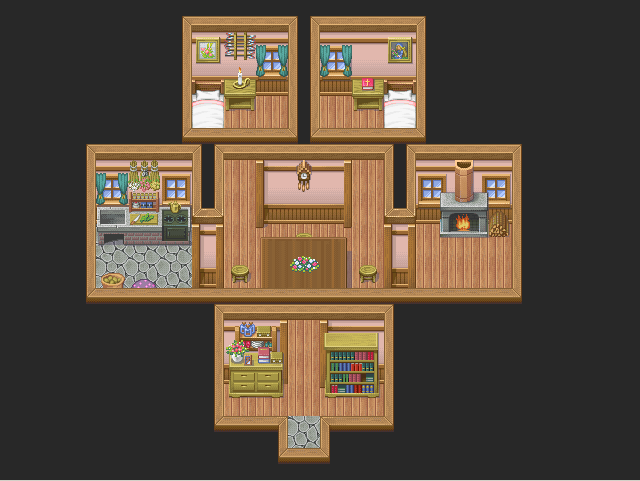
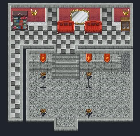
Small! SMALL! Always start small. A house is NOT as big as you think it is. A living room should be no bigger than to contain two couches, a bookshelf, a piano, and a fireplace -and that's pretty big, considering the sprite size. And not every living room would have all that, either. One couch and a fireplace are generally good enough to designate a living room. A bed and a bedside table is all you need for a bedroom. A kitchen can be the biggest room in the house, especially if you have the table in it. A lot of smaller houses might have everything in one room - a bed, no couch, and a stove. And good gravy, don't sprite a toilet for your house -it's tacky, and unless you're doing a modern day RPG, it doesn't really make sense. (I'm still wondering how Majora's Mask ended up with one toilet in the entire game that didn't manage to feel terribly awkward - I imagine it's because it wasn't a porcelain seat.)
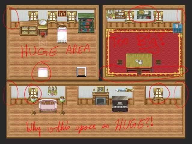
Anything in red is wrong. See those wall tiles in the corners, circled in red? Those are OUTSIDE wall corners; that is, they go on corners that poke outward, not inward.
The thing in the middle that looks like a shelf? THAT IS NOT A SHELF. It's an alternate top to the bookcase.
And the thing that looks like a bed? THAT IS NOT A BED. It's an alternate middle tile for the bed that allows your player (or others) to appear *under* the sheets. Put the middle of the bed on layer 1 and that errant tile on layer 2 for it to work right.
Also, notice the red carpet in that picture. Notice how it extends to three walls, but not the fourth (where the door is?) You need to use shift tiles (shift + autotiles) to expand it where it belongs. (More on shift tiles later.)
While it's true that rugs don't tend to fill an entire room, strange to me that one would make it touch 3 walls but not extend to the fourth - that's entering carpet territory and I really think it ought to extend all the way through the room.
And why did I circle those lovely windows? Because those are INTERIOR walls!
 <-That's better.
Walls and floors ALWAYS go on layer one - except for the farm interior, which is really goofy anyway. The wall autotile included in most interiors also goes on layer one - as you put the floor and walls in, it automatically formats.
There are different styles for making doorways, but I personally think the best way is to extend the floor through the wall and then use the wall autotile to cover the doorway. If you're using doors inside, you may want to custom sprite a top for the doorway - there's going to be a gap there doing it my way.
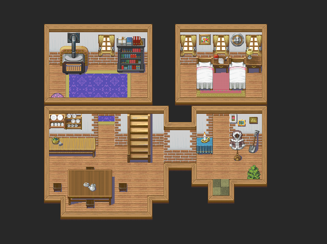
Remember that layout should be similar for city houses built around the same time. Farm house layouts can be as different as you please - depending on circumstances, they might have been built by the family living in them, so tailor it to your characters.
And pantries! Especially in castles and mansions, never forget the humble pantry - it's a great place to stash treasure.
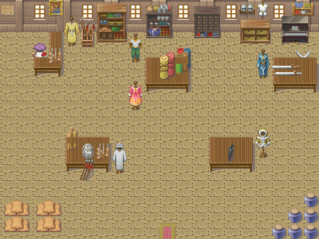
Stores should also be kept relatively small. Just because it's the ultimate store that has everything doesn't mean it ought to be equally huge. Think of the stores in Final Fantasy: They're a desk. That's it. Chrono Trigger has its merchants keep their crap behind the desk. If the merchants live in/above the store, keep the stairs and doorways behind the desk. The clerk doesn't want his customers invading his house! You, as the cunningly resourceful hero of the game, however, of course know other ways of getting up there - like going behind the counter (*gasp!*). Or climbing that conveniently placed ladder outside.
Oh, and this?
I see this WAY too often. It's not a lot, but it's TOO OFTEN. This is not good! Where are the walls? Any structure? Why is it so HUGE? And it appears to be a desert-type interior with a bit of everything just smashed in to fill the gaping SPACE.
Ships, castles, etc have essentially the same guidelines as the house.
Caves and other such underground areas ought to look natural: symmetry basically does not exist in nature. It is a man-made ideal to make things stand out. So, if you want your cave to stand out as something really important, go ahead, make it symmetrical. But if it's just a cave to get from point A to point B, make sure it's asymmetrical.
Sewers, however, were most likely designed by man, and therefore should have a planned, straight interior.
Decorations
I always say this: POOR PEOPLE DECORATE TOO. Just because your town is the grittiest, poorest place on earth doesn't mean that every house will be devoid of any decor. Curtains made from potato sacks. Posters or a single crappy faded bend photo tacked to the wall. People with no decor either choose to live like that, literally only come home to sleep, or don't have a house period. You're probably going to have to custom sprite or frankensprite some of this stuff, to make it stand out as "poor."
With rich characters, however, go hog wild. :D Have a room filled with nothing but gold bars! Gold-plated picture frames! Expensive-looking rugs! Three couches! They can probably afford anything you can imagine. Just don't do it for EVERY house - man, that gets really boring.
Stairs
Ah, the humble stairs. So many ways of accomplishing this feat, and it really depends on the look you want.
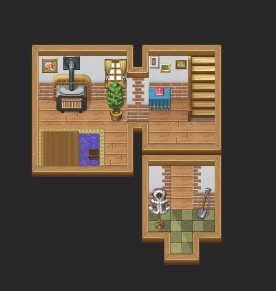 This type of stair enables a house to be divided into two or more maps, an upstairs and a downstairs. To use, you place a Player-Touch triggered event at the top, to transport the player to the upstairs map. This is the one I use most frequently.
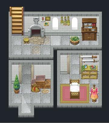 This one presents the stairs above the wall, Sims-style. I'm personally not such a big fan (there's a shadow on the black space!), but it's workable. Use an event, same as before.
 This is split-room engineering. The upstairs is but a hallway, but you can see both floors. There's no need for events, but I would sprite a small fence to place at the edges of the 2nd floor.
Anything in red is wrong. See those wall tiles in the corners, circled in red? Those are OUTSIDE wall corners; that is, they go on corners that poke outward, not inward.
The thing in the middle that looks like a shelf? THAT IS NOT A SHELF. It's an alternate top to the bookcase.
And the thing that looks like a bed? THAT IS NOT A BED. It's an alternate middle tile for the bed that allows your player (or others) to appear *under* the sheets. Put the middle of the bed on layer 1 and that errant tile on layer 2 for it to work right.
Also, notice the red carpet in that picture. Notice how it extends to three walls, but not the fourth (where the door is?) You need to use shift tiles (shift + autotiles) to expand it where it belongs. (More on shift tiles later.)
While it's true that rugs don't tend to fill an entire room, strange to me that one would make it touch 3 walls but not extend to the fourth - that's entering carpet territory and I really think it ought to extend all the way through the room.
And why did I circle those lovely windows? Because those are INTERIOR walls!
Walls and floors ALWAYS go on layer one - except for the farm interior, which is really goofy anyway. The wall autotile included in most interiors also goes on layer one - as you put the floor and walls in, it automatically formats.
There are different styles for making doorways, but I personally think the best way is to extend the floor through the wall and then use the wall autotile to cover the doorway. If you're using doors inside, you may want to custom sprite a top for the doorway - there's going to be a gap there doing it my way.
Remember that layout should be similar for city houses built around the same time. Farm house layouts can be as different as you please - depending on circumstances, they might have been built by the family living in them, so tailor it to your characters.
And pantries! Especially in castles and mansions, never forget the humble pantry - it's a great place to stash treasure.
Stores should also be kept relatively small. Just because it's the ultimate store that has everything doesn't mean it ought to be equally huge. Think of the stores in Final Fantasy: They're a desk. That's it. Chrono Trigger has its merchants keep their crap behind the desk. If the merchants live in/above the store, keep the stairs and doorways behind the desk. The clerk doesn't want his customers invading his house! You, as the cunningly resourceful hero of the game, however, of course know other ways of getting up there - like going behind the counter (*gasp!*). Or climbing that conveniently placed ladder outside.
Oh, and this?
I see this WAY too often. It's not a lot, but it's TOO OFTEN. This is not good! Where are the walls? Any structure? Why is it so HUGE? And it appears to be a desert-type interior with a bit of everything just smashed in to fill the gaping SPACE.
Ships, castles, etc have essentially the same guidelines as the house.
Caves and other such underground areas ought to look natural: symmetry basically does not exist in nature. It is a man-made ideal to make things stand out. So, if you want your cave to stand out as something really important, go ahead, make it symmetrical. But if it's just a cave to get from point A to point B, make sure it's asymmetrical.
Sewers, however, were most likely designed by man, and therefore should have a planned, straight interior.
Decorations
I always say this: POOR PEOPLE DECORATE TOO. Just because your town is the grittiest, poorest place on earth doesn't mean that every house will be devoid of any decor. Curtains made from potato sacks. Posters or a single crappy faded bend photo tacked to the wall. People with no decor either choose to live like that, literally only come home to sleep, or don't have a house period. You're probably going to have to custom sprite or frankensprite some of this stuff, to make it stand out as "poor."
With rich characters, however, go hog wild. :D Have a room filled with nothing but gold bars! Gold-plated picture frames! Expensive-looking rugs! Three couches! They can probably afford anything you can imagine. Just don't do it for EVERY house - man, that gets really boring.
Stairs
Ah, the humble stairs. So many ways of accomplishing this feat, and it really depends on the look you want.
Need a bright, sunny desert, but don't want it to look the same as your forest town? How about a dark, dank basement, covered in growth but little light? The way to accomplish these and more, dear friends, is to make the best use of Screen Tone.
How does one effectively use tints? Most people are capable of utilizing it, but are unsure of proper/correct usage. Now, obviously, from an artists standpoint, there is no "correct" color scheme. However, if you use a dark blue color scheme in a desert, people are definitely not going to think that it is hot and sunny. And if you just use the same color scheme the entire way through, it's going to be awfully dull! Read on, brave adventurer!
How to Do it
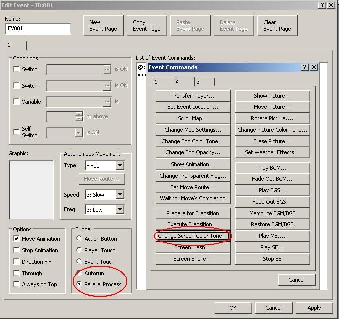
First things first: You must know how to access and utilize both Screen Tint and Fog. If you know how, skip to the next section. :D Since it's so basic, I'll use a basic 20x15 Grassland map for this. So you have your map, and it's happy and pretty and la-di-da. Let's enhance it, shall we? Make an event, and put it anywhere. Now decide: Do you want it to fade into the color, or do you want it to be that tint as soon as you come onto the map? If you want it to fade, go ahead and make an Autorun event. This is good for things like day to night changes, the beginnings of cutscenes, etc. If you want it to be automatic, make a parallel process. The reason for this is simple: With autorun, there's a split second delay - just enough to ruin that crucial scene!
So, select your trigger, and make an event command: Change Screen Tone. It's on the second page, 13th tag down on the left. It gives you slider bars with pretty colors and and a timer. Choose your colors and how long you want it to take to attain it, and off you go! If you're using an Autorun trigger, make sure you either add in Delete Event to the end, or set a self-switch and make a second page.
 ]
]
How to Effectively Use it
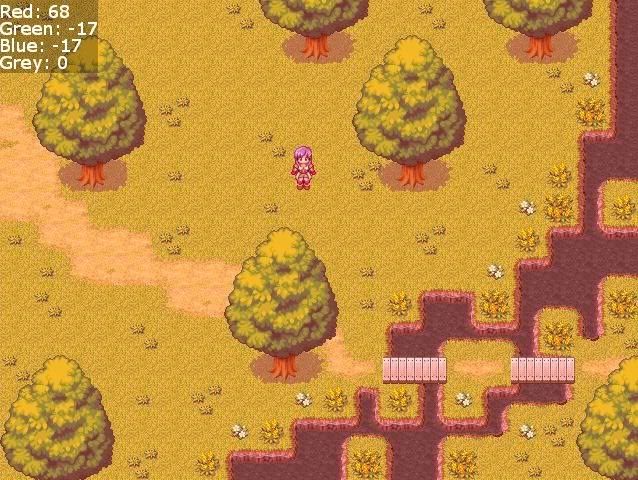
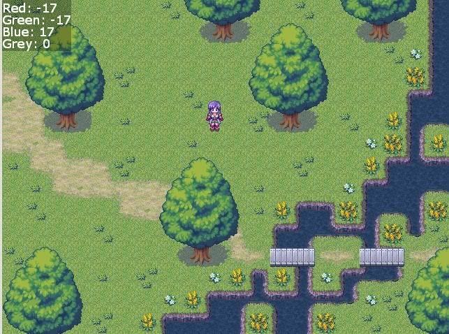
*NOTE: The grassland map used in this section is ONLY used as a reference for the different screen tints. It was made in approximately 3 minutes.
To increase WHITE (or the "lightness" of the scene), increase all the color sliders (except grey.) To increase BLACK (the "darkness"), decrease all color sliders. All Grey does is decrease colors/saturation; it does not make it particularly darker or lighter.
Really, the best way to do it is to play around with the sliders and find what you like, what clicks with you. But since some people will still have problems, I'll explain in some detail what you want for each scenario.
I'll just make a list, it's easier that way.
Sunrise/Morning: Slide the color sliders up around two notches (to about 34), but increase the red a bit above that. Grey at 0.
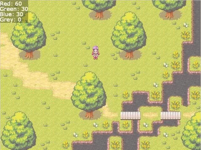
Noon (Bright sunlight): Either leave the colors as they are, or increase them all equally. Grey at 0.
Sunset: Exponentially increase the red; either decrease or leave both green and blue. Grey at 0.
Pre-sunrise/Post-Sunset: Increase the blue; decrease green and red. Increase Grey as evening grows deeper.
Night: Exponentially decrease red and green; decrease blue slightly less so. Exponentially increase grey.
Sepia: Increase red, decrease green and decrease blue moreso. Exponentially increase grey.
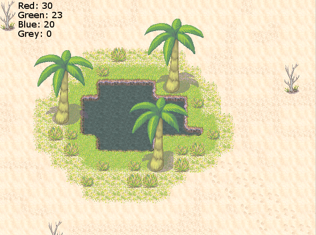
Desert - Daylight: Increase all colors evenly, or red a bit more. No grey.
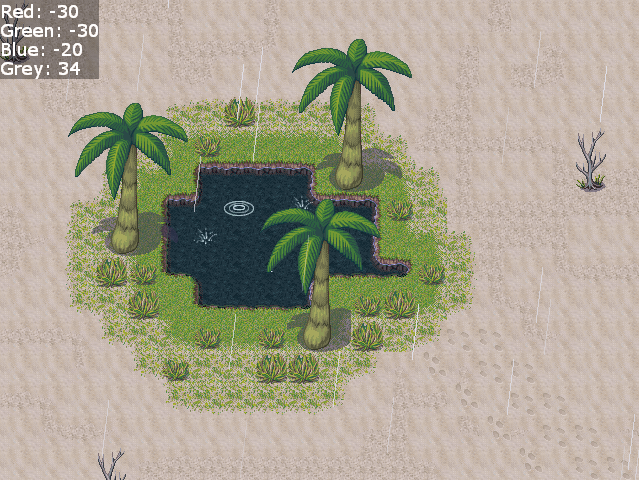
Desert - Rain: Reduce red and green evenly, reduce blue less so. Increase grey.
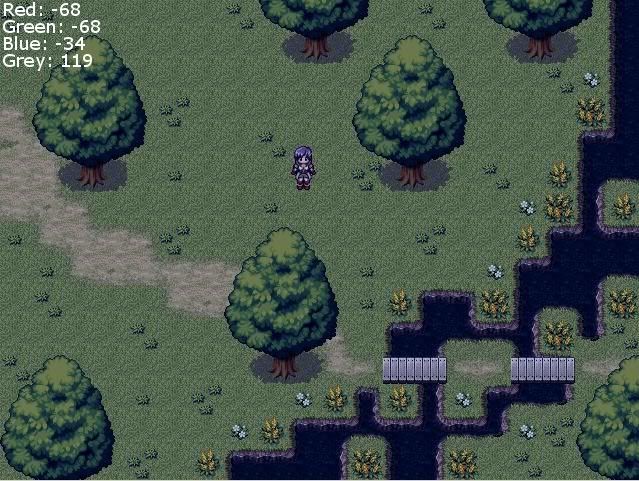
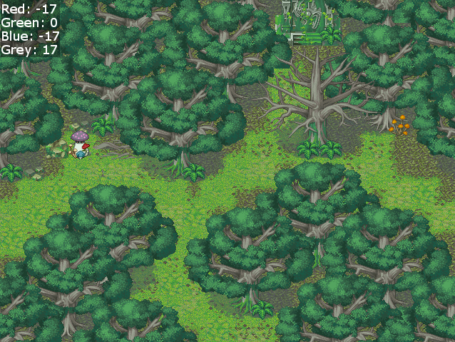
Forest: Decrease red and blue slightly. Increase grey slightly.
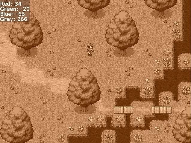
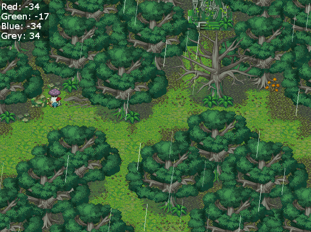
Forest - Rain: Decrease green slightly, red and blue moreso. Increase grey.
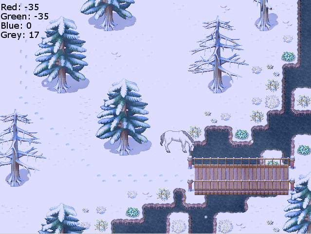
Snowscape: Decrease red and green. Increase grey.
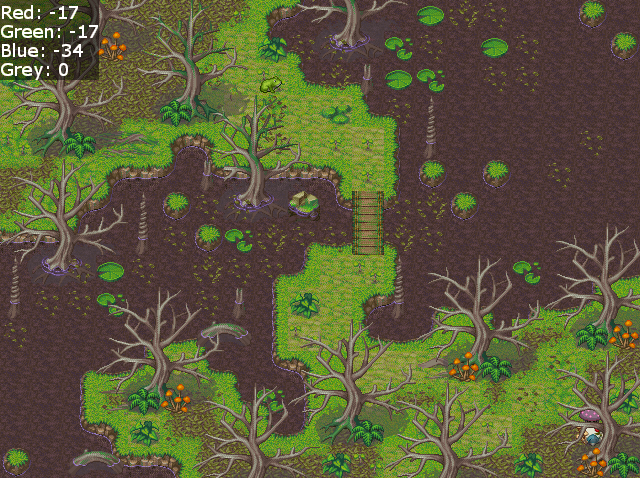
Swamp: Many ways to do this. I chose to decrease red and green and blue moreso. Grey at 0.
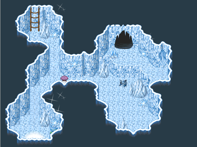
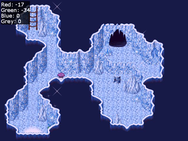
Ice Cave Again, many ways. I decreased red, and green moreso. Blue and grey at 0. Gives it a purplish hue.
How does one effectively use tints? Most people are capable of utilizing it, but are unsure of proper/correct usage. Now, obviously, from an artists standpoint, there is no "correct" color scheme. However, if you use a dark blue color scheme in a desert, people are definitely not going to think that it is hot and sunny. And if you just use the same color scheme the entire way through, it's going to be awfully dull! Read on, brave adventurer!
How to Do it
First things first: You must know how to access and utilize both Screen Tint and Fog. If you know how, skip to the next section. :D Since it's so basic, I'll use a basic 20x15 Grassland map for this. So you have your map, and it's happy and pretty and la-di-da. Let's enhance it, shall we? Make an event, and put it anywhere. Now decide: Do you want it to fade into the color, or do you want it to be that tint as soon as you come onto the map? If you want it to fade, go ahead and make an Autorun event. This is good for things like day to night changes, the beginnings of cutscenes, etc. If you want it to be automatic, make a parallel process. The reason for this is simple: With autorun, there's a split second delay - just enough to ruin that crucial scene!
So, select your trigger, and make an event command: Change Screen Tone. It's on the second page, 13th tag down on the left. It gives you slider bars with pretty colors and and a timer. Choose your colors and how long you want it to take to attain it, and off you go! If you're using an Autorun trigger, make sure you either add in Delete Event to the end, or set a self-switch and make a second page.
How to Effectively Use it
*NOTE: The grassland map used in this section is ONLY used as a reference for the different screen tints. It was made in approximately 3 minutes.
To increase WHITE (or the "lightness" of the scene), increase all the color sliders (except grey.) To increase BLACK (the "darkness"), decrease all color sliders. All Grey does is decrease colors/saturation; it does not make it particularly darker or lighter.
Really, the best way to do it is to play around with the sliders and find what you like, what clicks with you. But since some people will still have problems, I'll explain in some detail what you want for each scenario.
I'll just make a list, it's easier that way.
Sunrise/Morning: Slide the color sliders up around two notches (to about 34), but increase the red a bit above that. Grey at 0.
Noon (Bright sunlight): Either leave the colors as they are, or increase them all equally. Grey at 0.
Sunset: Exponentially increase the red; either decrease or leave both green and blue. Grey at 0.
Pre-sunrise/Post-Sunset: Increase the blue; decrease green and red. Increase Grey as evening grows deeper.
Night: Exponentially decrease red and green; decrease blue slightly less so. Exponentially increase grey.
Sepia: Increase red, decrease green and decrease blue moreso. Exponentially increase grey.
Desert - Daylight: Increase all colors evenly, or red a bit more. No grey.
Desert - Rain: Reduce red and green evenly, reduce blue less so. Increase grey.
Forest: Decrease red and blue slightly. Increase grey slightly.
Forest - Rain: Decrease green slightly, red and blue moreso. Increase grey.
Snowscape: Decrease red and green. Increase grey.
Swamp: Many ways to do this. I chose to decrease red and green and blue moreso. Grey at 0.
Ice Cave Again, many ways. I decreased red, and green moreso. Blue and grey at 0. Gives it a purplish hue.
Do you need something? Am I missing anything? Drop me a line! I'll do my best to remedy it.
")