Envision, Create, Share

Welcome to HBGames, a leading amateur game development forum and Discord server. All are welcome, and amongst our ranks you will find experts in their field from all aspects of video game design and development.
The Devil's Broker

The Devil's Broker

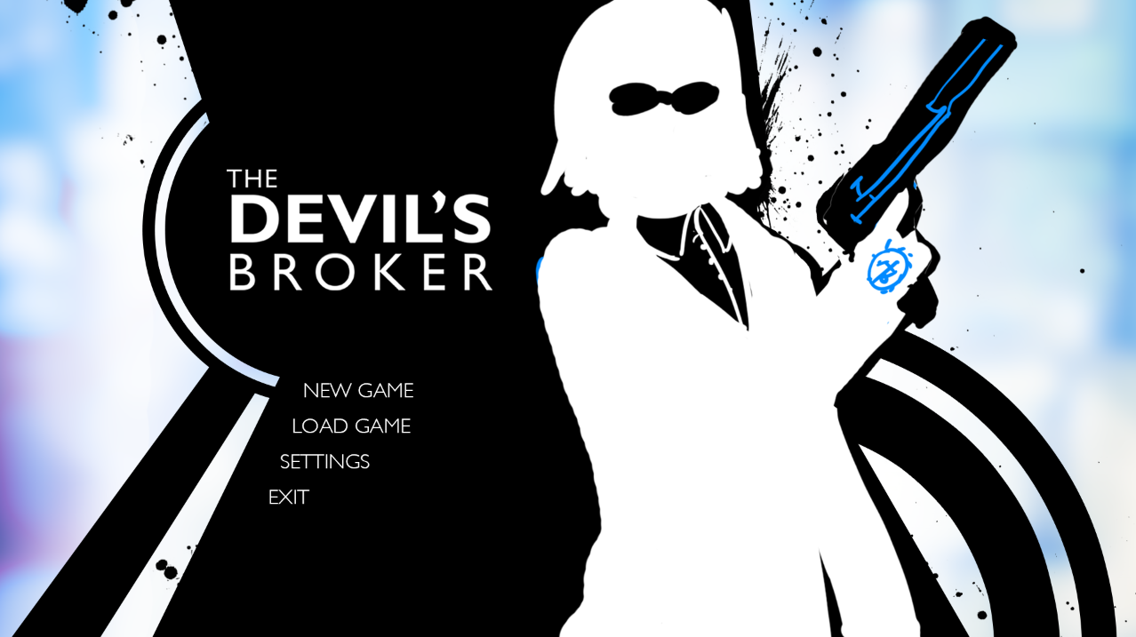
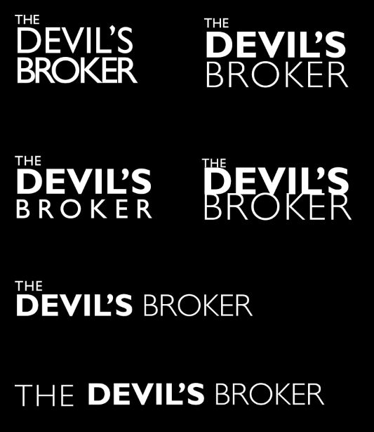
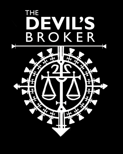
Of those there, I like
7f1635853d.png
the most. It flows very nicely.

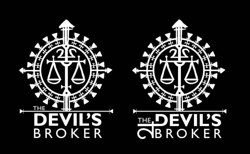
EDIT: On second thought, either of the middle row ones. The one on the left is much more standard / unoriginal looking, but it's simple and nice to look at. The one on the right is more unique for sure, and would work better as a logo due to the dimensions. They both look good, I can't pick :crazy:
 
I'm not sure I like the font. Something typographic might actually be better.

If I were to pick one, I'd go for middle-right. Middle-left I dislike the full circle as it pushes the font back and having the font on-top of the circle makes it harder to scan with your eyes the first time you look at it. I dislike the blue-to-red gradient on it as well. Middle-right's gradient is much easier to look at for me.

Lower-left and upper-right I think are okay as well, but you can't turn either one into a meaningful icon; they look worthy of being on the front of box-art. I can imagine the middle two and the lower right having accompanying icons (although middle-left's I can't imagine scaling very well, I prefer having a corner of the circle for that reason).


Having you tried removing "THE" and seeing how it all looks? Or making it lower-case against the main title? "The DEVIL'S BROKER". I see that you've made it smaller, but it could be that it's still taking up a lot of the attention. "Devil's Broker" sounds like a really powerful, memorable title so it may look more comfortable if "The" was made even less significant.
 
Thanks for the input, guys! Unfortunately I think I've decided I hate all of them and am going back to the drawing board. Here's tonight's update, experimenting with different font layouts (ignore the mysteriously changing apostrophe):

620935e9f4defd07865a35a5f0ea913b.png


Xilef, I'm actually pretty happy with the font. I'm trying to evoke a Bond feeling, and it's a very Bond font. Removing the The from the title, hmmm... I kind of like it, but I also feel like it's kind of weird not to have the article.
 

arev

Sponsor

I like the 4th one the most. One thing bugs me about it, though. The contours of the K and E are sticking out from I and L too much.
So, how 'bout this:
OGhLNtN.png
?
 
The 4th is also my favourite, with the same issue Arev has. And though their fix goes a long way to dealing with the problem, I feel it throws the balance off, due to 'Broker' only having a gradient.
I'm not sure, maybe have it so that the bottom of Devil / top of Broker is broken off or something? I'm not sure. Or perhaps colour would help to detract from the K E issue.
 
arev":2woxfd6p said:
I very much dislike the use of shadowing here


Peri, I'm liking top-left and middle-left. Also, I didn't mean remove "The" entirely, just reduce it's importance in the graphic. Lower-case "he", different colour, turned side-ways against the "DB", something like that.

Perhaps play off a gambling theme with "broker" and "devil" (gambling is what comes to mind for me with both these words); make the O a roulette wheel or something? Would have the added benefit of giving you an icon. If it's relevant to the game's theme, of course.
 
Yeah, middle left is my favorite too. Here are today's iterations.

Also, the game has to do with wizards and guns and contracts moreso than gambling. I have plenty of symbols that are relevant, just, errr, how do incorporate them... I have my magic circle thing, various other magical circle things, and the astrological symbol for Jupiter. I tried playing with the latter for a few of these. Here are today's lackluster iterations:

fc0a60e4d5c9bb9c81c3a6827c0ea9cc.png
 
I wanna work my glyphy thing into it real bad but idk if this is too much or what

0af41e2b2d4b082d63f6ee54c316e701.png
31783548a16beeacc0b57c00014962a6.png

26bcb82ba77f817d8a6354b6462c8771.png

I want to like it real bad, but it's probably too much, arg

682c341fdabd2b0004b57a22500f290b.png

This is totally not going to work out
 
I really like the bottom right and the one just above it.
When it comes to the glyph, I could see it working to the right of the one I liked. :)
 
Perihelion":2ergddf9 said:

I like the middle-right. I see it as sideway jupiter symbol
Jupiter_symbol.svg


Kinda has an arcane vibe to it that way. But it might be too unfamiliar to everyone else who'll probably just see it as a decorative curl. Maybe if it had pointed serifs or a different lineweight to it for contrast? Relate it to your glyph by using the arrows and thick & thin line elements that your glyph has but without being too obtuse.
 
Yeah, it is the Jupiter symbol. I don't really care if people don't recognize it. I dunno, I like the idea, but I'm not sure I like the execution of any of those... Maybe I'll play with it more later.
 

arev

Sponsor

I'd go with the third one this time. I think the glyph would be better off left in the background. Larger, maybe fading in/out or some cheap trick with specular highlights, so that only a part of the image is visible, depending on the light's position.
 
Hello I'm bad at updating my thread. What do you guys think about this title screen? I feel like the shapes/composition still need some work, but I'm not sure what.

a9b84671ff09523880ac01af239ab497.png


Character art is still a placeholder, obviously.
 
Woohoo! I finally finished the current draft. This is the last major pass over content. Next is adding choices, then polish, then it's off to the editor.

I know a few people wanted to read it, but I'm not sure if any of them are here. If you want to check it out and give me feedback, let me know.
 
Thanks! Yeah, I've been mired in writing for months, but I can at long last see the end of the tunnel. Should be able to update more regularly once I'm working on art again.
 

Thank you for viewing

HBGames is a leading amateur video game development forum and Discord server open to all ability levels. Feel free to have a nosey around!

Discord

Join our growing and active Discord server to discuss all aspects of game making in a relaxed environment. Join Us

Content

  • Our Games
  • Games in Development
  • Emoji by Twemoji.
    Top