Envision, Create, Share

Welcome to HBGames, a leading amateur game development forum and Discord server. All are welcome, and amongst our ranks you will find experts in their field from all aspects of video game design and development.

Mapping Workshop II

Mapping Workshop II: Basic RM Mapping Concepts (Continued)


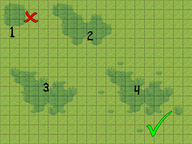
Mapping in 2D can be a complicated task. It isn't just just throwing a bunch of tiles onto a 2D plane and hoping for the best and instead requires careful planning and tile placement. Certain aspects come into play such as avoiding symmetrical mapping and how palette coincides with the mood and tone of a map. These are more advanced aspects and ones I hope to address eventually.

I think that while the XP and VX RTP are not the best set of tiles, they provide a base that everyone can use and learn from. This workshop is the first part of basic and intermediate mapping of the RTP. The workshop will contain tutorials on basic mapping. The goal of this is to inform members and mappers on the importance of a good map. Hopefully, anyone who reads this will learn a thing or two.

The mapping and example shown are basic examples and do show some mistakes! The reason is that I am trying to avoid edits of the RTP and trying to show progression. Some of the mistakes will be address and then eventually changed in further tutorials. Again, its more to show progression.

This workshop will be split off into different parts located below.
 
V) Direction

Now that we have explained autotiles and walls, I am here now to answer the why. Why do we use walls and autotiles? Because it creates direction.

Direction is extremely crucial in mapping and in game making in general. Using autotiles and walls are a great way to lead the player in the right direction. I am not saying that you should not have branching paths or hidden chests in the distance because that is also a good thing in maps; I am saying that you should still give a general direction on where one should be going. If you place the player in the middle of a field without any sense of direction or goal, then the player gets frustrated.

When using autotiles and cliffs, you are able to create a general direction easily. Creating a dirt path from one end to the other is a basic technique that can guide the player in the direction you want the player to go. At the same time, the player can also deviate from the path and explore the outer reaches of the map and looks for hidden goodies and stuff.

cliffedit1.png

Here is an example of a pretty linear path created by cliffs.

4.png

again, not the best map but with the path I make it clear where I want the player to go. If he wants to explore the wilderness beyond, he can. But if a player just wants to get to point B, then they are able to as well.

Its about being flexible to both kinds of players. Some people want to get on quickly while others want to sit down and explore. You need to cater to both kinds of people.
 
VI) Tile Size

Tilesize plays a huge role in how we map objects using the RTP and it is something that most people do not consider especially when using RPGMAKER. Tile size is 32x32, not 16x16 or 8x8. So what exactly does this mean when mapping out tiles and objects?

When you create larger tiles, they tend to easily repeat more and it is easier for our eyes to catch the repeating patterns. Also, things are spaced further apart which also creates symmetrical mapping. Symmetrical mapping is a term where objects tend to create repeating patterns and lines and tends to break immersion. Things seem more artificial when mapped in a lines and shapes. The idea is to avoid symmetrical mapping because of these negative effects.

Again, bigger tiles means more negative space and with too much negative space your map will become boring and monotonous. This is why Final Fantasy maps do not work in RPGMaker, the size of tiles are 4 or 16 times bigger.This is pretty common knowledge but many people tend to forget that the tiles are abnormally huge in the RPGMAKERs and you have to map differently than those of your favorite gameboy games and 16 bit platformers.
 
VII) Mapping: The Basics

Many people have a hard time mapping certain objects and making their map look nice and clean. The first thing I can suggest is to practice and look at other well-mapped maps. You won't get it the first or even third time but with a little effort it will click.

The most common problem I see is people mapping maps way too big. They shoot for these giant maps that span 200 x 200 tiles. Not only that, they create giant paths that fill half the screen. Shrink it up. Try to use as little space as possible. Too much blank space means that the map will get boring.

lwfield1.jpg

This is an example of a map that is overly large. There is nothing there, no point to the space. Its just empty and its empty without meaning. If your space does not have a purpose, then remove it. Every single tile should have a purpose.

Fairyworld.PNG

Even though it lacks a path, its a decent start. There is enough going on to keep things interesting. Is it a great map? No. Is it an okay map? Depends who you ask. It is a good start though.


First thing to think about mapping is the theme. What exactly are you trying to create? What is the tone? What is the atmosphere? How does it relate to my game and what makes it unique? Then its a matter of placing objects that fit the theme. The forest above clearly is a magical meadow forest filled with fairies and flowers. Is it a super specific map? No. Is it generally specific? Yes. Again, an okay start and is a good benchmark.

Then its about placing tiles. Just place some specific tiles around the map that fulfill the purpose. Make sure to vary your tiles, vary the spacing between tiles, and follow a path and theme. Things like where tiles should be placed and how they should be placed and even what exact tiles you should use will be explained in future tutorials. Right now, its about basic mapping and the how to's.

Remember to make sure every tile has a purpose!
 
VIII) Object Placement Tips

This is not the "where to map tiles" section, this is the "how to map tiles" section. This is basically going to show you some basic tips to map certain objects around each map and to state some common tips and tricks. Its not a lot of tips (I am avoiding some things) but its a few to get you started.

lovemapping.png

2 weed and 1 weed tiles place together can help alleviate the blockiness of the tiles and make a map look more natural. Try to avoid the 5 tile weeds and 4 tile weeds as they are block shaped.
If you want to go the extra mile, try making your own varying weed tiles.

cresentc2.png

an example of overused weeds.


stairbears.png

Stairs dont appear in nature, so unless they are manmade dont use them!


mountain.png

Make sure not to put long grass in super big clumps. Try to spread it out evenly in smaller chunks.

grasstutorial.png

Look at this. While I do think that the long grass is a little bit too much, this is a great example. Also, those 1 tile circle grass clumps are not meant to be spread around the map, they are used on the edges of long grass to give them more curve and shape.


First off, I have never had to map a house that is more than 15x12. Ever. If you are mapping a simple house this should be the maximum size. Always.

StevensHomeAttic.png

This is a huge map for such a small space. This is an attic/training dojo. While its a great idea there is no need for such a large space. SHRINK IT.

hellodojo.png

Another dojo. Its smaller, and looks like an attic.

Here is another example. Look at this shed.
storeroom.png

Its small and tiny and chop-full of crap. It looks like a shed and isnt too big. Remember that the tiles are 32x32!

Tindy":5t487mdc said:
Small! SMALL! Always start small. A house is NOT as big as you think it is. A living room should be no bigger than to contain two couches, a bookshelf, a piano, and a fireplace -and that's pretty big, considering the sprite size. And not every living room would have all that, either. One couch and a fireplace are generally good enough to designate a living room. A bed and a bedside table is all you need for a bedroom. A kitchen can be the biggest room in the house, especially if you have the table in it. A lot of smaller houses might have everything in one room - a bed, no couch, and a stove. And good gravy, don't sprite a toilet for your house -it's tacky, and unless you're doing a modern day RPG, it doesn't really make sense. (I'm still wondering how Majora's Mask ended up with one toilet in the entire game that didn't manage to feel terribly awkward - I imagine it's because it wasn't a porcelain seat.)


These are just a few simple, basic tips. I dont want to get into things like palette and symmetry yet so this is pretty basic. I will address these issues in the next edition.

For right now, just try to map using basic tips and common sense.
 
I know this was really basic and not super duper informative and actually pretty awkward. I am really, really, really trying to avoid some super key things that I will address next time and go super in depth about. (Things like why you should place tiles a certain way and what tiles to use)

The next mapping tutorial will include:

  • How Object Clutter Ruined My Marriage
  • Symmetrical Mapping: Its Not Always Good Being Square
  • Mapping and Palette: Setting the Scene and Creating Mood

Workshop Activities are:

Getting You Started!


  • Create an interior map that is only 15x13
  • Create a map that clearly pushes the character in a certain direction.
  • Create a map that uses weeds and long-grass correctly.
  • Think up of any other tips and tricks you might have when it comes to mapping. (If its really good Ill add it to the tutorial!)

These are just some examples to get you started. Post anything and everything here and I will critique it using the lesson above.
 
Now, it looks like no-one posted in this MAJOR and DETAILED article that rocks
B took lots of time to write this, and we need to pay the proper respects!

My man, you did great.
I might join in to fix up my stuff, but there are some other matters to attend to.

However, i have read it all, and i have grown wiser.

THANK YOU
 
Dude you are SUPER right when it comes to this:


I think people see that the minimum size for a map is 20x15, so they feel like they HAVE to fill it out. they super don't. I would rather walk into a small, well-decorated room, even if it's cramped, than to walk into a giant, rectangular, empty one. the smaller the room, the more opportunity you have to make it feel lived-in and organic. the RTP doesn't provide much as far as clutter goes. so make your spaces small enough to maximize what little you have to work with!

Your workshops are super, btw, bacon <3


edit: Oh! I wanted to mention. FLOOR PLANS.

If you go onto a house builder's website, they will offer floorplans for you to peruse. Take advantage of these! Even if your game is set in medieval europe, little has changed through the eons as far as how houses are basically laid out.

(Some major house builders to look up: Beazer, Lennar, KHovnanian, Mercedes Homes, Michael Sivage Homes, Richmond American, D.R. Horton)

Examples:
http://www.lennar.com/New-Homes/Nevada/ ... =200190533
http://www.ryland.com/find-your-new-hom ... eFloorPlan

Technically, if you look up enough floor plans, you won't even NEED to try to come up with a clever layout on your own that works. Notice how stairwells are usually in the center? That floors with bedrooms ALWAYS have bathrooms? That kitchens are usually located in the rear of the home? That master bedrooms always have adjoining bathrooms, and that they are only really ever on the ground floor if it's located in a hot climate? That the largest windows typically face north?

These are little construction quirks & rules that have been around since the ancient Romans' times. You can learn a lot from them when it comes to making an interesting interior map.

A regular bedroom is typically only about 2-2.5x bigger than a full-size bed, square-footage-wise. Start with that!
 

Spoo

Sponsor

I meant to post last night but I needed sleep. I'll get to it in a moment.

interiorsmall1.png


I can't say I'm thrilled with the result here. At first I was aiming for something like a Japanese sort of guest house, hence the genkan, but the default tileset didn't really match the style. Still, I hope it accomplished what needed to be accomplished.

exteriordirectional1.png


Not sure how I feel about this one. I really felt like doing a snow field, so I did. It felt a little cramped on a playtest, but that felt right somehow or another.
 
Quoting Venetia

"I think people see that the minimum size for a map is 20x15, so they feel like they HAVE to fill it out. they super don't. I would rather walk into a small, well-decorated room, even if it's cramped, than to walk into a giant, rectangular, empty one. the smaller the room, the more opportunity you have to make it feel lived-in and organic. the RTP doesn't provide much as far as clutter goes. so make your spaces small enough to maximize what little you have to work with!"

I kinda agree with you, but then I think it also depends on if you use the super exterior/interior tilesets, u know.. the all tilesets infused into 1. That way you have a lot more stuff to add into the rooms to decorate it.

Some nice maps going on in the post though.. great going.
 

Thank you for viewing

HBGames is a leading amateur video game development forum and Discord server open to all ability levels. Feel free to have a nosey around!

Discord

Join our growing and active Discord server to discuss all aspects of game making in a relaxed environment. Join Us

Content

  • Our Games
  • Games in Development
  • Emoji by Twemoji.
    Top