
Perihelion
Sponsor
The bulk of this post applies mainly to people who aren't making RPGs, but bear with me here.
There's a lot of discussion about custom vs. RTP, of course, but I'm not making this thread to say that the RTP sucks and you should use something else (for example, obscure rips). There's more to it than that.
Now, we all know what RPGs look like.


You don't have to know anything about those games to tell what genre they are. They all have certain things in common: perspective is usually about 3/4, the sprites are tall, objects overlap stuff behind them. And this works great for the standard JRPG with random battles and all the usual trappings. People in the RM community use graphics like this, too. I mean, we're making RPGs, right?
Except that isn't always the case. There are scripts for TBSes, ABSes, what have you floating around, and people use them occasionally--but almost without fail, they use standard RPG graphics to go with them. It's automatic or something, and it shouldn't be.
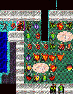
First let's take look at TBSes. Here are some screenshots:


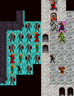
See how different these are? They're either isometric or have sprites that fit on one tile. Why? Because that way you can see shit. Isometric accomplishes this because the angle makes it so you can see sprites standing behind other ones, as well as differences in terrain height, but let's pay more attention to the non-iso ones since that sort of thing is more feasible in RM. Let me half-ass a mockup so you can see what I'm talking about.
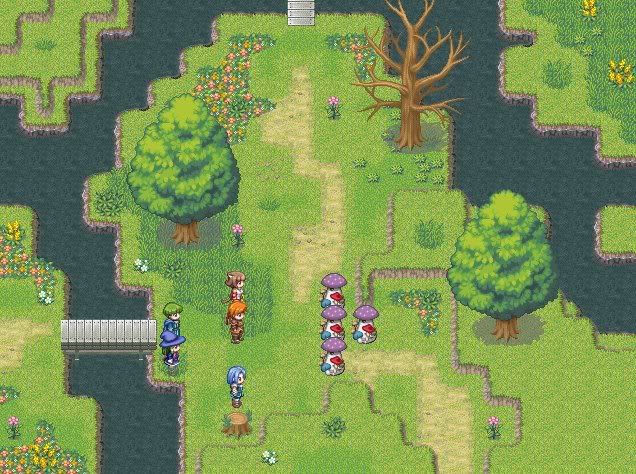
Pretend this is a TBS!
Do you see how this looks bad in comparison? The sprites overlap and block each other from view, and it makes it harder to see where things are at a glance. This can get confusing with small flying enemies, which appear to be in the square above the one they're actually in. In comparison, one-tile sprites make it extremely clear where all the units are, and everything is very neatly in its correct place. It looks deliberate instead of slapped together with what you have on hand--and moreover, it actually looks like a TBS. Short sprites might not be as pretty as tall ones, but your game should work first and be pretty second. An alternative is making your tiles non-square, but you can't really do that in most makers.
Which leads into my next point. If you're making a TBS, your maps shouldn't have shit everywhere, and your backgrounds should be relatively simple and/or low-contrast compared to the sprites so that you can easily see where all the units are. You can see this in the Fire Emblem, Advance Wars, and Shining Force screenshots, which use only one or two tiles solely for visual interest; the rest denote terrain differences. But let's look at that last one again, which is from Exile II: Crystal Souls.
The cave floor outside the building is too saturated, but the teal contrasts sharply with the dark soldiers, making them visible, and the background itself doesn't use the same level of contrast as the sprites. Compare this with the brick floor inside. The detail of the background makes it hard to see where the sprites end and the floor begins, which makes the whole thing look muddier than it should. Here's another screenshot from the same game:
The robe guys' legs are impossible to see against the background unless you're looking for them. This could perhaps be fixed with some kind of border or by using more contrasting palettes for the background and the sprites.
Now, let's talk about ABSes. In general, they're much more forgiving in terms of perspective than TBSes, and a lot of professional action/adventure games use 3/4ish perspective and tall sprites, but there are exceptions. Here are some screens to think about:


The Zelda GBA games are effective because, again, you and enemies both fit on one tile, so it's easy to see how things line up for ranged attacks, and enemies don't overlap, which makes it easy to see what's going on around you. The GTA screen is similar in that regard. It's one of the few top-down games I saw when I was browsing through screenshots, but it's nice--you can see EXACTLY where everything is in relation to you at a glance, which makes it easy to target ranged attacks (in theory, anyway; haven't played it). The Harry Potter one is there as a representative of action games with tall sprites, but I imagine firing projectiles takes more mental effort in it than in the other two because you have to account for perspective or your missile passing behind enemies. I'm not sure how big a deal it is since I haven't actually played that either, though. Again, that kind of perspective probably works fine for ABSes in general, but you should be aware that other and possibly better options exist.
As far as mapping goes, you need a lot more open space than you do in an RPG, and again, you don't want a lot high-contrast tiles on the ground because it's distracting. If you want more variation, try tiles with similar palettes but different textures. Other than that, I don't think I have much to say about ABSes.
There are things to look out for in RPGs, too. For example, if your game doesn't generally have a lot of objects you can interact with, it can help to make the ones you can (say, puzzles) stand out from the background a little. Stuff like that.
Also, this applies to much more than graphics, but don't put in things you don't need. The fact that you can doesn't mean you should. In particular, I see a lot of HUDs around, but HUDs serve no purpose in standard JRPGs; the only exception I can think of off the top of my head is a small box to show the name of the place you just entered, but that should go away quickly. If no battles are actually taking place on the dungeon map, you do not need to see your HP and EXP and gold and inventory and etc. It takes up unnecessary space.
I'm sure I've only scratched the surface of the relationship between graphics and gameplay, but I think it's an important topic that isn't often discussed here. What other things should you consider?
There's a lot of discussion about custom vs. RTP, of course, but I'm not making this thread to say that the RTP sucks and you should use something else (for example, obscure rips). There's more to it than that.
Now, we all know what RPGs look like.
You don't have to know anything about those games to tell what genre they are. They all have certain things in common: perspective is usually about 3/4, the sprites are tall, objects overlap stuff behind them. And this works great for the standard JRPG with random battles and all the usual trappings. People in the RM community use graphics like this, too. I mean, we're making RPGs, right?
Except that isn't always the case. There are scripts for TBSes, ABSes, what have you floating around, and people use them occasionally--but almost without fail, they use standard RPG graphics to go with them. It's automatic or something, and it shouldn't be.
First let's take look at TBSes. Here are some screenshots:
See how different these are? They're either isometric or have sprites that fit on one tile. Why? Because that way you can see shit. Isometric accomplishes this because the angle makes it so you can see sprites standing behind other ones, as well as differences in terrain height, but let's pay more attention to the non-iso ones since that sort of thing is more feasible in RM. Let me half-ass a mockup so you can see what I'm talking about.
Pretend this is a TBS!
Do you see how this looks bad in comparison? The sprites overlap and block each other from view, and it makes it harder to see where things are at a glance. This can get confusing with small flying enemies, which appear to be in the square above the one they're actually in. In comparison, one-tile sprites make it extremely clear where all the units are, and everything is very neatly in its correct place. It looks deliberate instead of slapped together with what you have on hand--and moreover, it actually looks like a TBS. Short sprites might not be as pretty as tall ones, but your game should work first and be pretty second. An alternative is making your tiles non-square, but you can't really do that in most makers.
Which leads into my next point. If you're making a TBS, your maps shouldn't have shit everywhere, and your backgrounds should be relatively simple and/or low-contrast compared to the sprites so that you can easily see where all the units are. You can see this in the Fire Emblem, Advance Wars, and Shining Force screenshots, which use only one or two tiles solely for visual interest; the rest denote terrain differences. But let's look at that last one again, which is from Exile II: Crystal Souls.
The cave floor outside the building is too saturated, but the teal contrasts sharply with the dark soldiers, making them visible, and the background itself doesn't use the same level of contrast as the sprites. Compare this with the brick floor inside. The detail of the background makes it hard to see where the sprites end and the floor begins, which makes the whole thing look muddier than it should. Here's another screenshot from the same game:
The robe guys' legs are impossible to see against the background unless you're looking for them. This could perhaps be fixed with some kind of border or by using more contrasting palettes for the background and the sprites.
Now, let's talk about ABSes. In general, they're much more forgiving in terms of perspective than TBSes, and a lot of professional action/adventure games use 3/4ish perspective and tall sprites, but there are exceptions. Here are some screens to think about:
The Zelda GBA games are effective because, again, you and enemies both fit on one tile, so it's easy to see how things line up for ranged attacks, and enemies don't overlap, which makes it easy to see what's going on around you. The GTA screen is similar in that regard. It's one of the few top-down games I saw when I was browsing through screenshots, but it's nice--you can see EXACTLY where everything is in relation to you at a glance, which makes it easy to target ranged attacks (in theory, anyway; haven't played it). The Harry Potter one is there as a representative of action games with tall sprites, but I imagine firing projectiles takes more mental effort in it than in the other two because you have to account for perspective or your missile passing behind enemies. I'm not sure how big a deal it is since I haven't actually played that either, though. Again, that kind of perspective probably works fine for ABSes in general, but you should be aware that other and possibly better options exist.
As far as mapping goes, you need a lot more open space than you do in an RPG, and again, you don't want a lot high-contrast tiles on the ground because it's distracting. If you want more variation, try tiles with similar palettes but different textures. Other than that, I don't think I have much to say about ABSes.
There are things to look out for in RPGs, too. For example, if your game doesn't generally have a lot of objects you can interact with, it can help to make the ones you can (say, puzzles) stand out from the background a little. Stuff like that.
Also, this applies to much more than graphics, but don't put in things you don't need. The fact that you can doesn't mean you should. In particular, I see a lot of HUDs around, but HUDs serve no purpose in standard JRPGs; the only exception I can think of off the top of my head is a small box to show the name of the place you just entered, but that should go away quickly. If no battles are actually taking place on the dungeon map, you do not need to see your HP and EXP and gold and inventory and etc. It takes up unnecessary space.
I'm sure I've only scratched the surface of the relationship between graphics and gameplay, but I think it's an important topic that isn't often discussed here. What other things should you consider?